I’m always thinking of restaurant brands good and bad. There have been a number of them on my mind lately, and I can’t help but think they aren’t meeting their potential. Maybe it’s an incongruence between offering and visual communications, or it could simply be a matter of poor design principles all together. Either way I’ve compiled a list of the what I consider the worst restaurant logos, why they stick in my mind and why I think they’re missing the mark. Here they are in no particular order:
I used to love Dairy Queen growing up. Their original logo was on point for the time. Great typography, unique, and a shape that truly defined the brand visually. However, DQ had a problem. They wanted to grow into new offerings beyond dessert. That’s not necessarily a bad thing except they didn’t go all the way with the strategy. They didn’t want to lose their stronghold on the dessert brand. The problem is that losing marketshare in the original category is an inevitability when you add new, differing products. This is true in any industry. Dairy Queen ignored this fact and decided to walk a nonexistent line by changing to DQ (a name the market gave them), then added “Grill & Chill” to pull in that hot food offering. The result? A mishmashed logo treatment that blurs the lines of what Dairy Queen was and is. The design is a jumbled mess, no longer easy to visually interpret meaning it’s easily over looked.
I’ve never been to Checkers, but I’ve seen their commercials many times on TV. The offering is Americana at it’s finest, but they’ve failed to bring their logo up to the times. Most brands start with a less than ideal identity due to low budgets when they start. Winning brands build off their initial logos keeping the elements that resonate and dropping the elements that don’t. With Checkers, the original logo uses color treatments in patterns that creates a visual effect of strobing and jostling to the eyes. That issue combined with the many extra elements involved in the look leave the door open for simplification that would increase the brand’s strength. Maybe this means keeping a Checkered element combined with a strong typeface? Maybe it means keeping the red box, but changing the color so it works better with the checkered pattern and eliminates the strobe effect.
I like Jason’s Deli’s food. It’s quite good and fresh-tasting. What I don’t understand is the logo that doesn’t represent this offering. The logo is simple, but not in the way that conveys the true offering of the restaurant. The typography is close to being well-rendered, but the “J” form and the spacing between the “a” and “s” is just off. Beyond that, the defining oval shape doesn’t carry enough meaning nor is it visually distinct to stand out from other brands. An oval is an oval. Jason’s Deli could easily leverage the uniqueness of their logotype and add in a visual cue that they could start to own. Think about the Levi’s shape and the original Dairy Queen shape. If Jason’s Deli can find a shape like that with a few alterations to the typography they’ll hit pay dirt.
The problem I’m seeing with Panera’s image is its dated look. This restaurant brand continues to lead the market with it’s offering. It’s even promised to offer fresher food throughout its stores by 2015. The logo was once great. It was different and strong in the market, but time has gone on with little movement forward. The current orientation has too many elements competing for visual strength making it look jumbled and over designed. The bread girl, lines through the type, oval around “bread”, and a wavy box with lines encapsulating it all fight for attention. Panera could use a brand update, not an overhaul, but an update. They could bring the bread girl to the forefront, drop the superfluous line work and leave out “bread” all together. Most people call it “Panera” anyway. Why not go with the flow?
I know I’ll get some flack for talking about Cookout. Their cult-like following is a rarity, and a testament to staying true to your brand. It’s their logo solely that bugs me. It has some defining elements that could easily be visually owned by the brand. By strengthening the typography and rendering the graphic element with cleaner lines and enough whitespace to allow the eye to interpret them appropriately, Cook Out could have a brand identity strong enough to match the offering so many people love.
Papa Johns has a strong brand. They own the word “better.” Through their constant dedication to driving home that message for decades, they’ve earned the right to be known as “better pizza.” There are a few issues with PJ’s brand logo, as some lovingly call it. First, it visually reads “Pizza Papa Johns.” It leverages an overused color palette for the pizza industry making it difficult to stand out from other competitors including Mom and Pop pizza joints. Finally, it has too much happening graphically with the banner treatment, enclosing shape and shadow effects. Papa Johns could take what they’ve built so far with their brand, simplify, and push into the next ten years of better pizza and ingredients with a better brand.
Five Guys took the country by storm with its no-nonsense approach to the better burger wars. The burgers are awesome and the interiors perfectly match the no-nonsense approach. Although the logo is also congruent with that brand experience, the design could be kicked up a notch to gain marketshare and even better recognition. People visually interpret color, then shape, then words. If Five Guys would move towards a big “5” in the logo with a strong typeface for the logotype they could push their brand further. Also, the use of the Microsoft standard typeface for the “Famous Burgers and Fries” descriptor leaves the door open for selecting a better type family that the brand could own.
American Deli’s brand logo is suffering from the same thing as Five Guys’ logo. The use of system standard fonts creates a look that isn’t unique. Everyone encounters these fonts with many other businesses and restaurants which creates a connection making American Deli seem not unique. That correlation can be a bad thing if another restaurant uses the same typeface as there will be a subliminal feeling connecting the two. The use of the word “American” brings forth a multitude of visuals American Deli could leverage instead of the poorly rendered shooting star graphic. This restaurant logo has potential that a few fixes could see through.
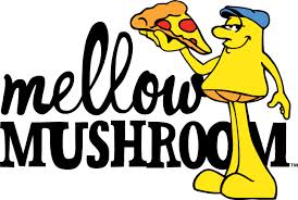
There’s something cool and uniquely awesome about the “mellow” type treatment, and the “mushroom” typographic hand rendering. It’s the yellow mushroom that brings the brand down a few notches. Luckily I’ve seen them use this less and less, but it still pops up often. The mushroom idea has merit. It creates a visual connection to the brand name and its vibe. While this guy makes a great mascot (which they use), it should be simplified more so fresh eyes can quickly identify the brand. Think about the way Wendy’s has morphed their iconic brand into the now. The opportunity for Mellow Mushroom to maintain their stronghold while moving things forward is there. They have a loyal following and have built a strong point of differentiation. It’ll take just a few tweaks to move this brand forward.
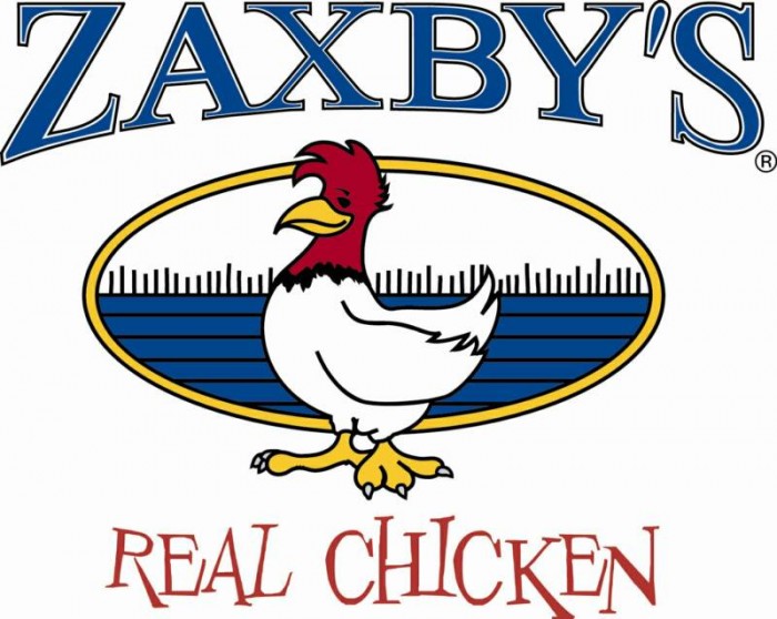
When I first moved to Atlanta all I heard about was Zaxby’s. They have a great following of brand cheerleaders behind them and a sort of challenger brand mentality. A quirky attitude adds to their point of differentiation from major players like Chick-Fil-A. The issue is that besides the typeface used for the tagline “Real Chicken”, the logo isn’t as quirky as the brand’s attitude and vibe. The brand name “Zaxby’s” is set in a large serif typeface with a double outline. That effect decreases readability, and the typeface is too classic to be quirky. Zaxby’s could use an update to the logotype that trades in the classic for something more fun and off the wall. This would further position the brand appropriately. Secondly, the logomark is too complicated with a color palette that conflicts with the illustrations line work. It’s hard to visually discern the outlines from the blues and reds. By cleaning up their chicken illustration the brand could make it easier to recognize from far away. Think of Starbucks’ alterations to the mermaid. Now, Zaxby’s doesn’t have to go that clean and modern, but a little touchup could go a long way here.
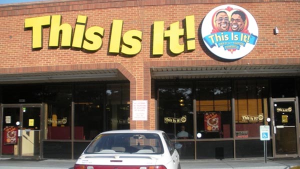
I couldn’t resist including this local restaurant’s logo for obvious reasons.
What are some of the worst restaurant logos you’ve encountered? Why are they so bad in your opinion?


4 Responses
The Five Guys “logo” has always bugged the shit out of me—I’m not sure it even qualifies. I picture somebody typing it in word and taping it on their first burger cart … and that was it.
Hhaha. That may very well be how it started.
You forgot about Smashburger. If you look at their stores too fast, you may think you driving past a GameStop.
Oh yeah! Spot on man. I like how clean the rest of their design work is, but that logo has got to go-go.