Hip Chips restaurant branding

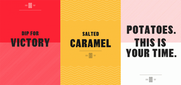
Despite being England’s number one snack food, no concept had been created with chips, or crisps as the Brits call them, as the focus. That is until Hip Chips was born. The new concept takes a modern approach to the look and feel that’s confident, strong, and unapologetic. The team leveraged classic English design elements to root it in the culture: red pin stripes, classic typefaces, etc.

I rather enjoy the poster directions that shirk the go-to use of food photography and instead focuses on the type.

Designed by Ragged Edge

The Forktales Podcast™: Interviews with restaurant industry leaders and visionaries

Restaurant and advertising industry headlines and thinking

Reviews of restaurant experiences from around the globe 

Reviews of our favorite design, business, & restaurant books

Our favorite typography and fonts

Inspiration in your inbox

Get the latest inspiration in your inbox every Monday morning, for FREE!

"*" indicates required fields

This field is for validation purposes and should be left unchanged.

Delicious Bits in your Inbox!

Get the latest and greatest content delivered to your inbox for free!

"*" indicates required fields

This field is for validation purposes and should be left unchanged.