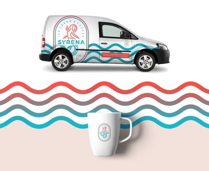
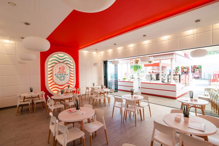
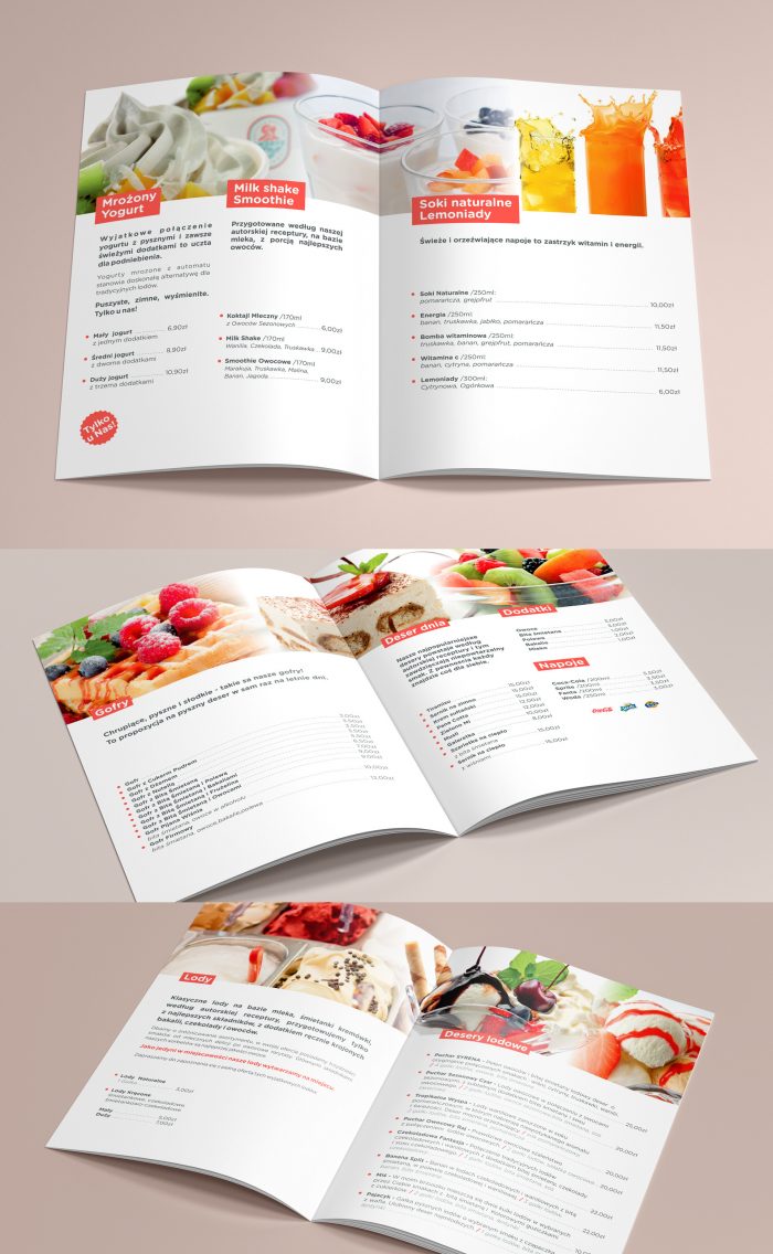
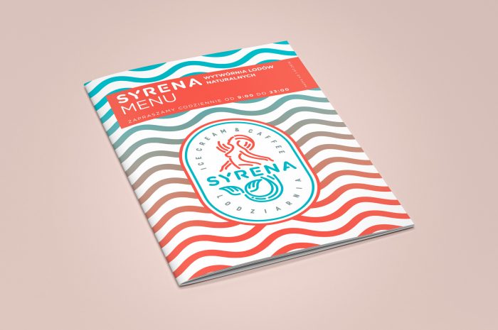
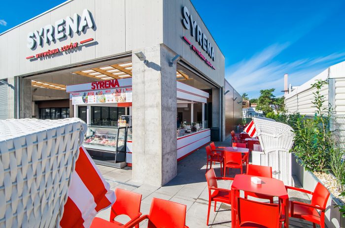
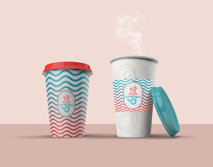
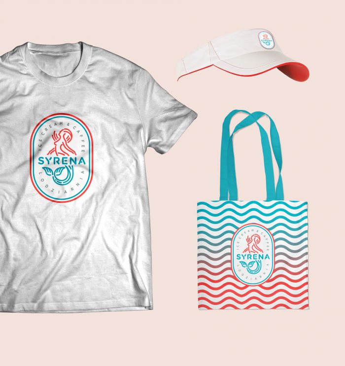
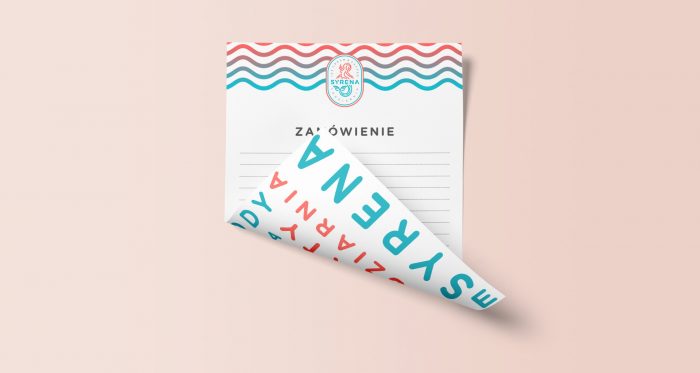
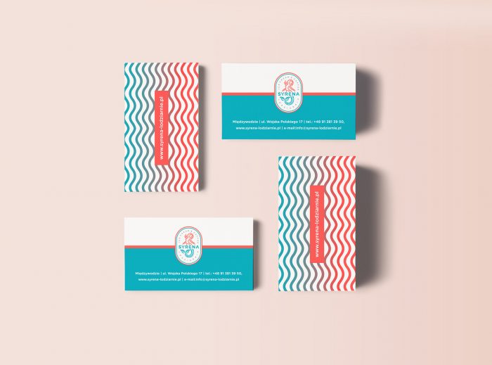
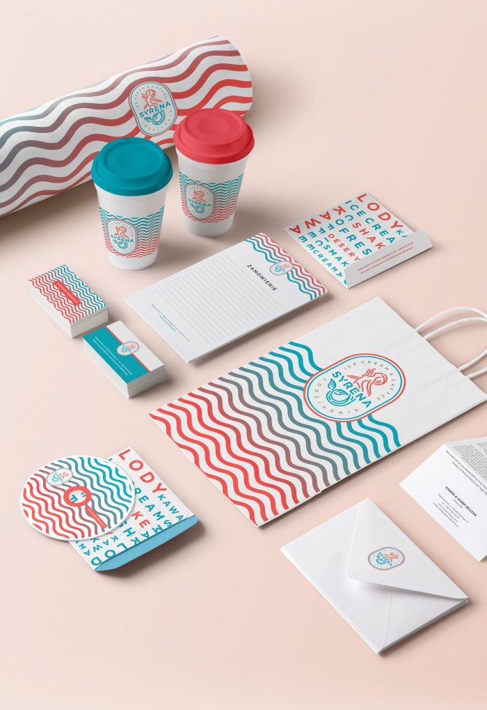
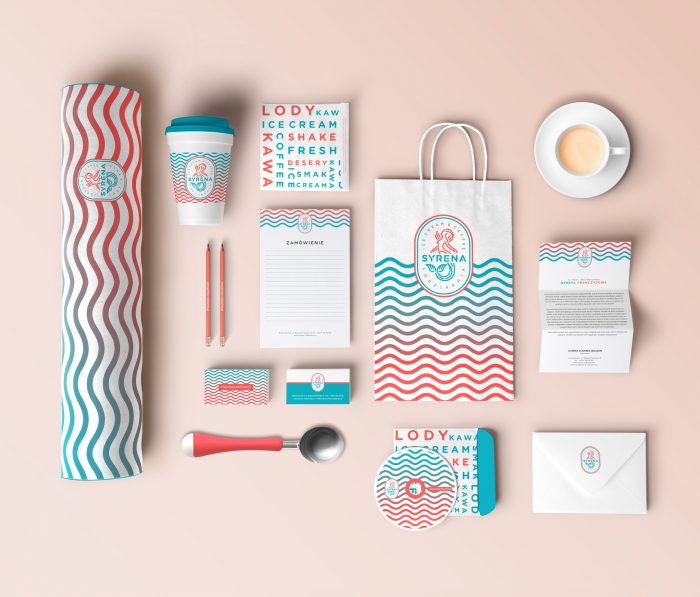
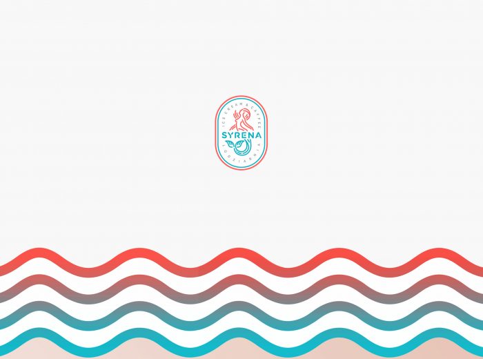
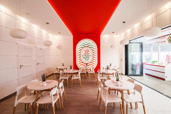
Who doesn’t love a great scoop of ice cream? So, this morning I wanted to share a brand identity project for an ice cream shop in Poland. The brand has a super fluid feel sparked by wavy lines that tie the many touch points together. The colors mix cool and warm excellently to create a vibrant vibe. Syrena, which is another word for mermaid, inspires the brand’s primary mark. We’ll call it the second coolest mermaid logo ever (sorry, Starbucks owns it.) The brand does fall a little short with the menu design. In my opinion it seems too corporate and clean, and it doesn’t carry the soft, flowing vibe through. But that’s a minor ding in an otherwise brilliant brand identity.
Designed by Agenza