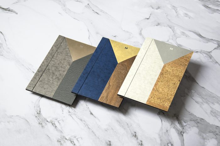
This classy design aesthetic features an identity heroed by beautiful typography. The restaurant, Mere (pronounced “Mary), is located in London’s Fitrovia. The concept was created by chef Monica Galetti and sommelier David Galetti. The identity ropes together a breathtaking interior design that features many textures and patterns, with simple typography and patterns that nod to the interiors. It’s a beautiful collaboration between mediums. The interiors concurrently pull inspiration from the print design elements in fresh ways like the use of the “M” letterform for fixtures, and gold lettering for 3D signage moments.
Designed by Bibliotheque in London, UK