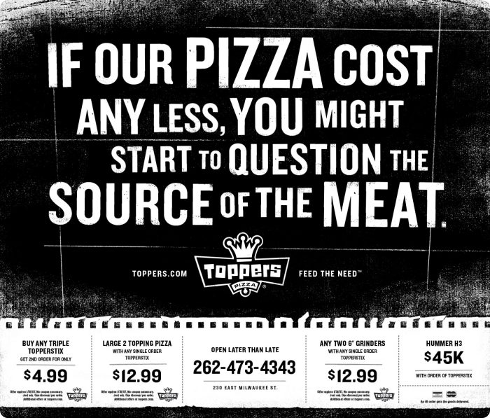
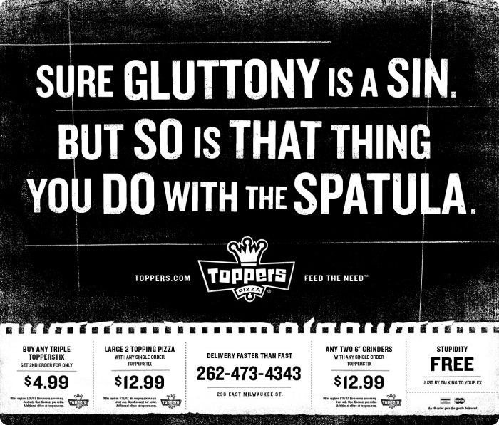
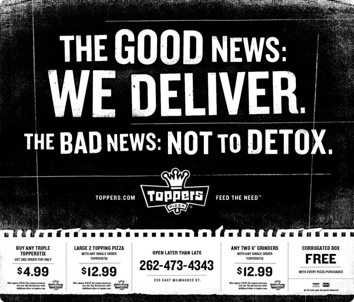
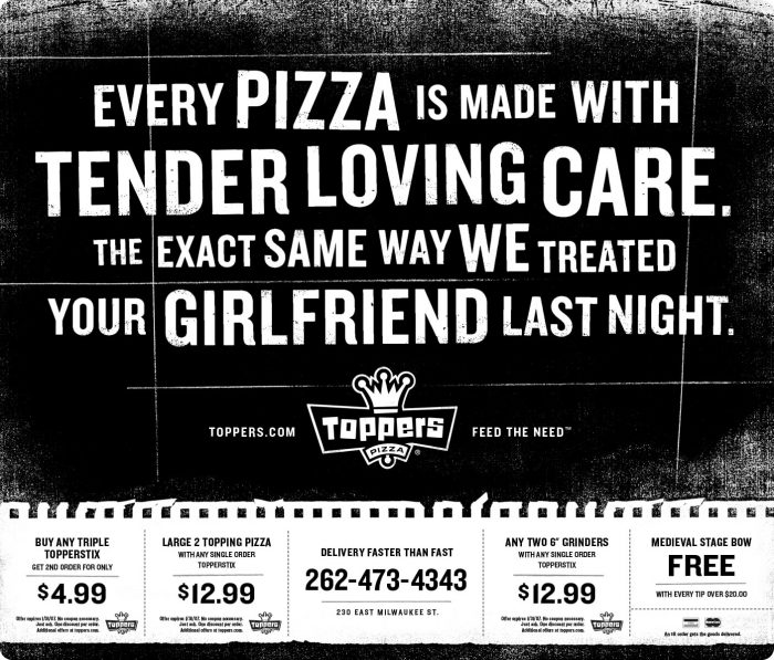
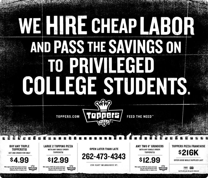
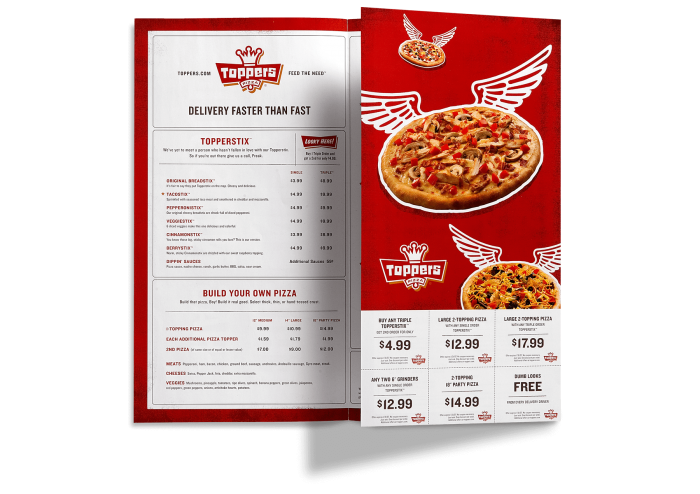
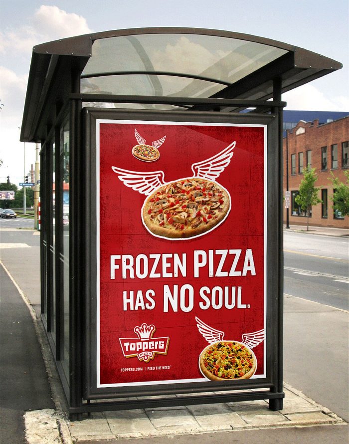
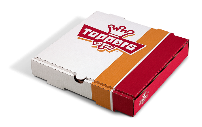
Pizza is such a saturated market. Most of the time Italian cultural cliché’s are employed to give a sense of authenticity. Topper’s takes a much different approach as they establish a unique voice and visual tone throughout the brand.
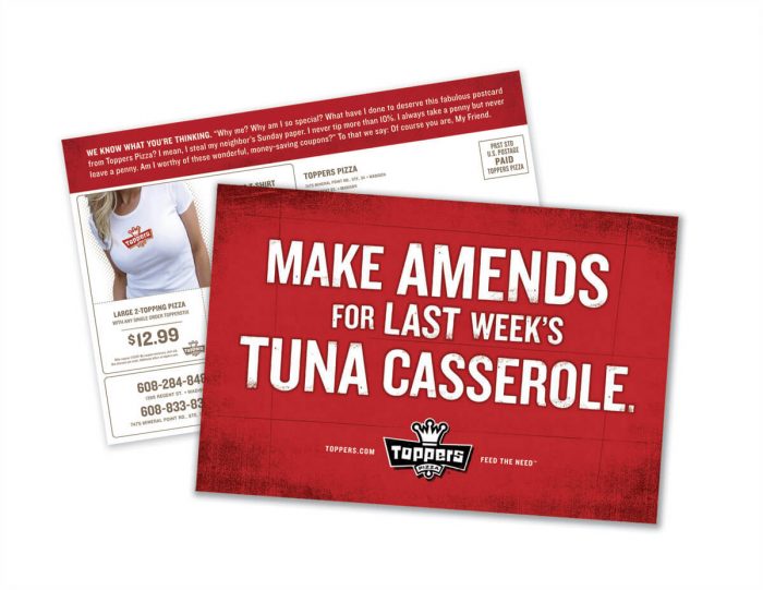
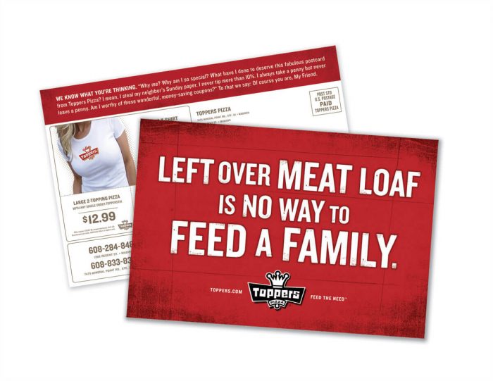
There’s a street-style, gritty aesthetic to the brand from beginning to end. This is seen in advertising from background textures to the way typography is distressed, and even in the photography. The photography is given a silverish effect making the colors blown out, raw, and gritty. This is much different than most pizza brands which helps Toppers stand out the crowded brandscape.
Shine United took cues from the established brand and pushed things further. They approach the perceptions of high price, dieting, and home cooking with unforgettable attitude making would-be boring marketing pieces more fun and memorable. Have a look at the full suite of touch points. This is how you market pizza.
Designed by Shine United