Vocation Brewing branding & packaging

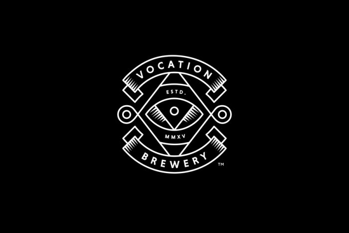
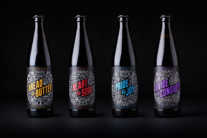
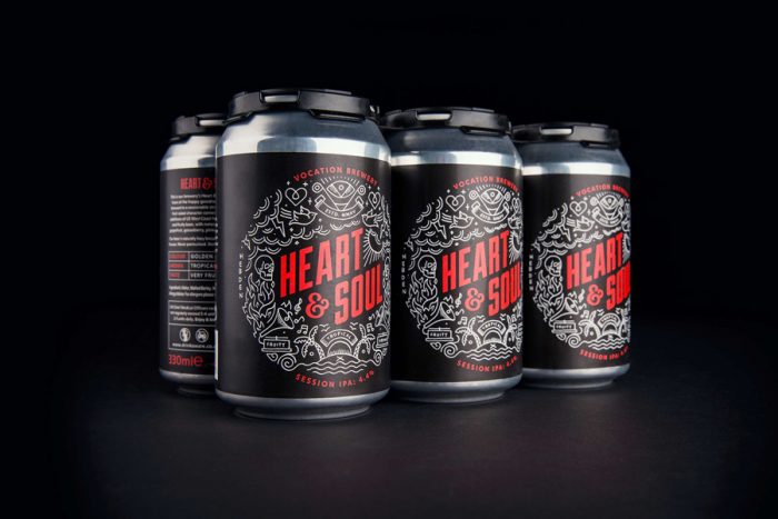
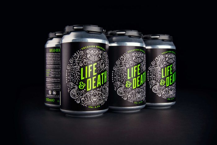
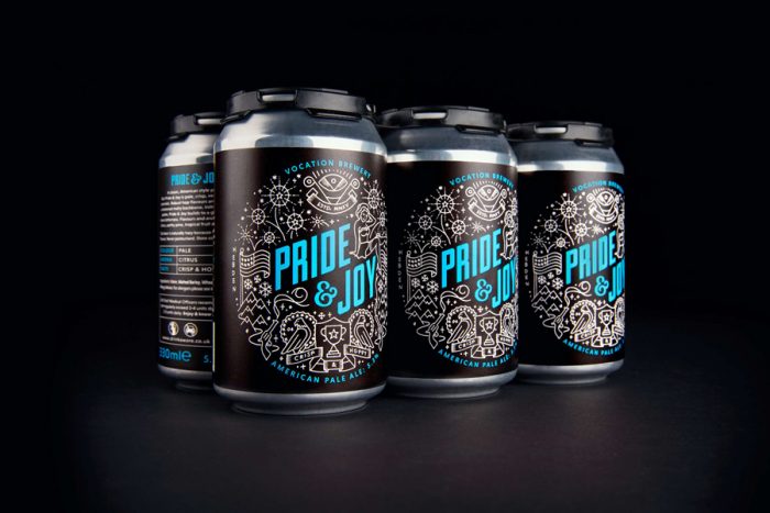
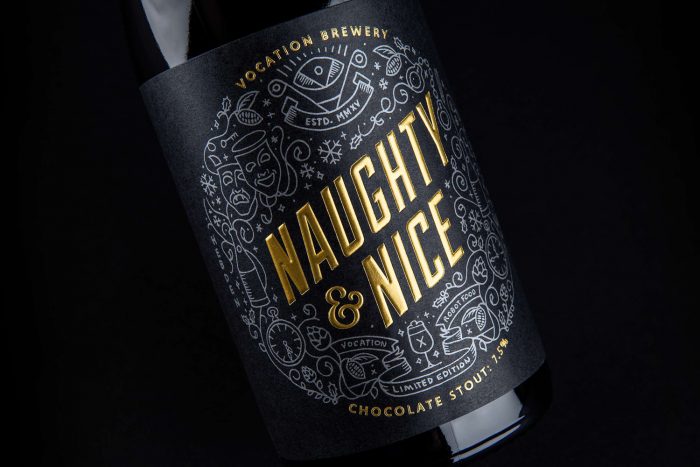
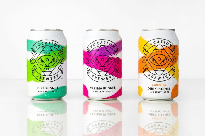
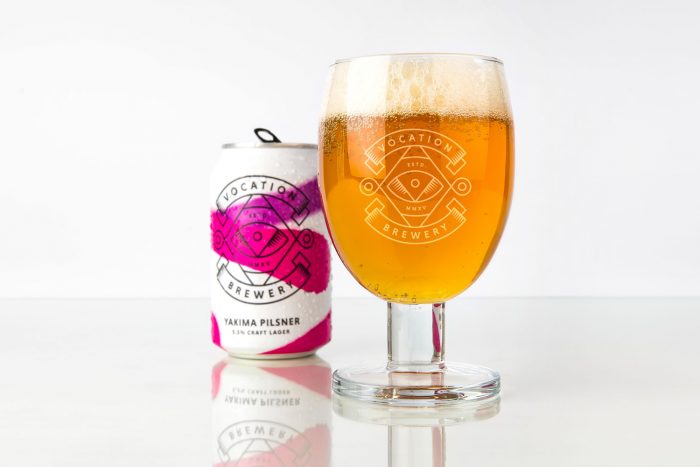
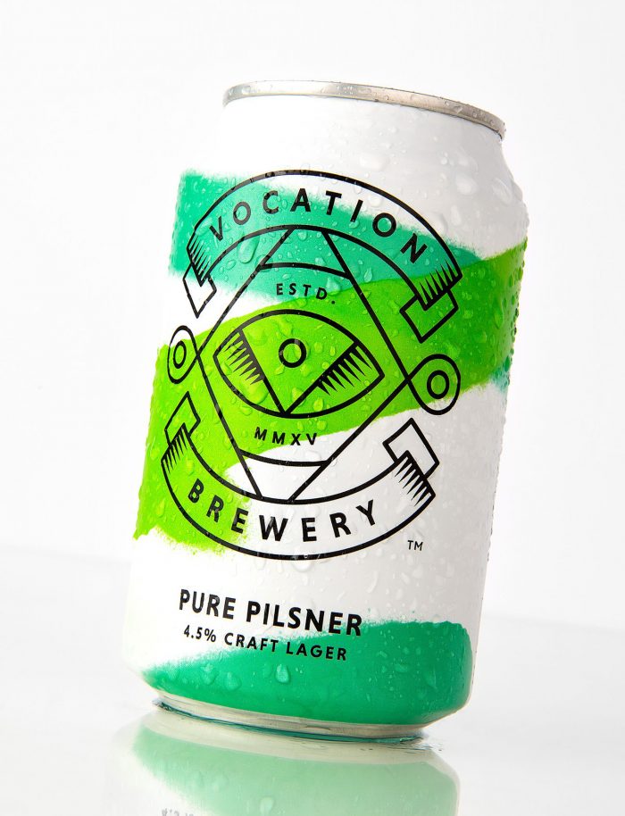
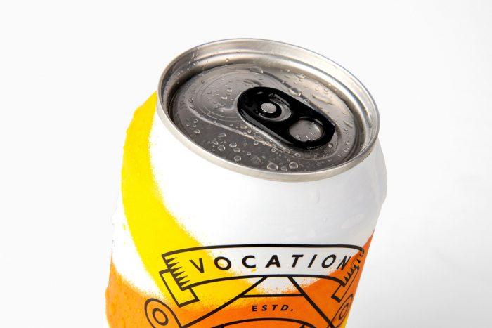
I’ve had my eye on the branding and package design for Vocation Brewing with the intent to post at some point. What pushed me over the edge was when I saw the new cans design direction on BP&O. The cans combined with the 750 bottles direction were just awesome and really brought the whole brand to life.

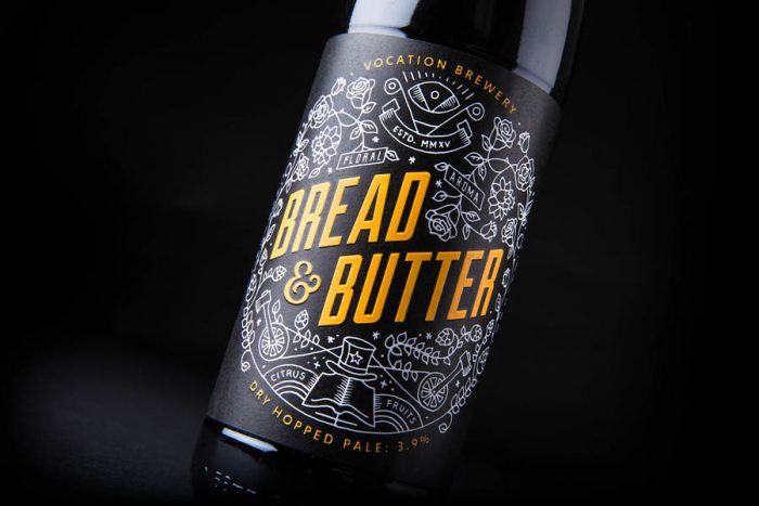
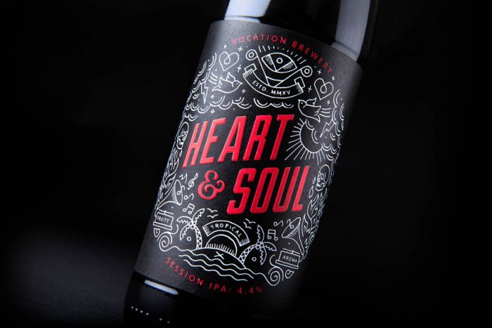
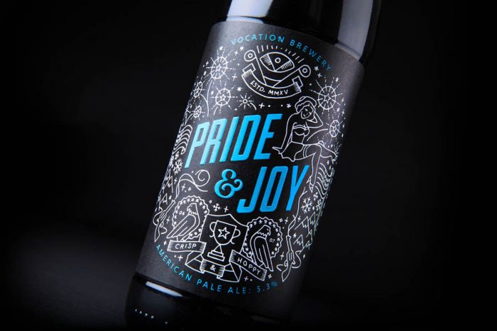
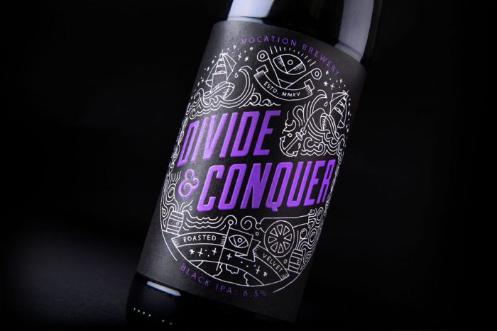
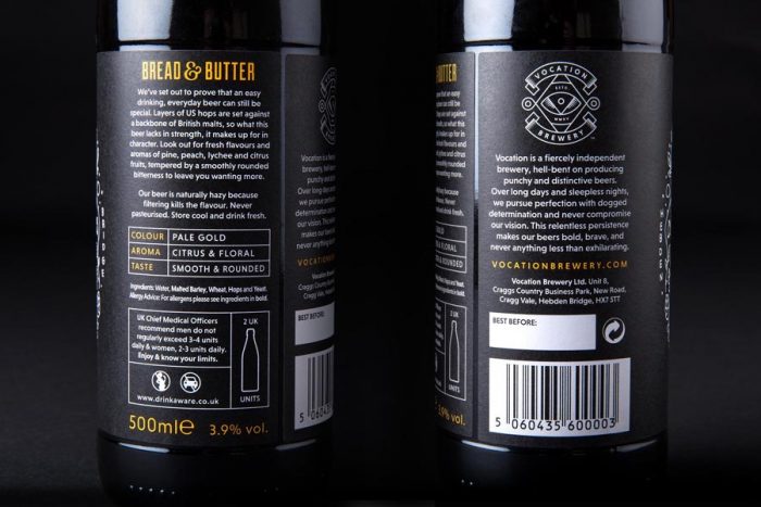
The original bottles have been out there for a bit and they’re quite lovely. The cans are new the line up and take the brand into a new direction without losing control over where they’ve been. It’s all in the color. Vocation’s use of high contrast black and white is offset with one pop of brilliant color to denote the beer style. And it works fantastically.

Designed by Robot Food

The Forktales Podcast™: Interviews with restaurant industry leaders and visionaries

Restaurant and advertising industry headlines and thinking

Reviews of restaurant experiences from around the globe 

Reviews of our favorite design, business, & restaurant books

Our favorite typography and fonts

Inspiration in your inbox

Get the latest inspiration in your inbox every Monday morning, for FREE!

"*" indicates required fields

This field is for validation purposes and should be left unchanged.

Delicious Bits in your Inbox!

Get the latest and greatest content delivered to your inbox for free!

"*" indicates required fields

This field is for validation purposes and should be left unchanged.