Flyrite restaurant branding

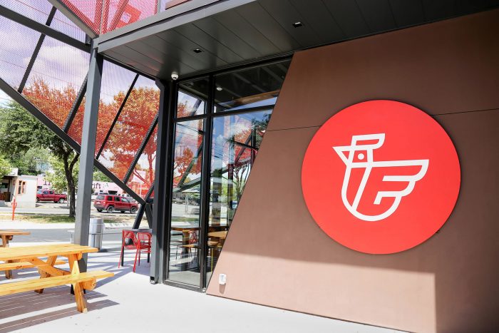
Flyrite is the next concept in line to tackle the sourcing story. They apply it to their chicken sandwich experience from the strategy through naming and brand identity design.

The simplified mark is clean and intriguing with a simple “F” formation embedded in a chicken that looks like it’s taking flight (chickens can fly?). This mark leads the charge with the aesthetic and is supported with a mix of typography with screenprinted textures and vibrant, saturated photography.

Designed by Foxtrot in Austin, Texas


The Forktales Podcast™: Interviews with restaurant industry leaders and visionaries

Restaurant and advertising industry headlines and thinking

Reviews of restaurant experiences from around the globe 

Reviews of our favorite design, business, & restaurant books

Our favorite typography and fonts

Inspiration in your inbox

Get the latest inspiration in your inbox every Monday morning, for FREE!

"*" indicates required fields

This field is for validation purposes and should be left unchanged.

Delicious Bits in your Inbox!

Get the latest and greatest content delivered to your inbox for free!

"*" indicates required fields

This field is for validation purposes and should be left unchanged.