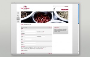
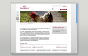
Martin Oberhaueser, through Mutabor Design brings us Beisser. Here’s the run down:
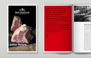
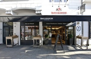
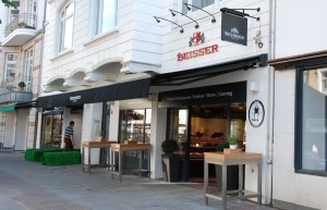
Beisser GmbH & Co. Kg is a traditional company with a reputation for the finest meat products in Hamburg. For over 175 years, the family-owned business has stood for outstanding quality. At Beisser, tradition and innovation go hand in hand.
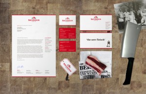
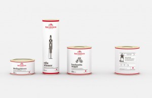
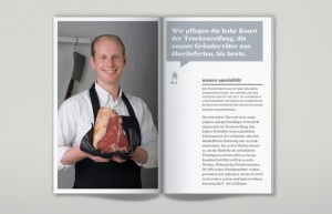
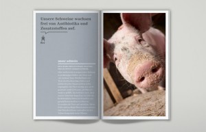
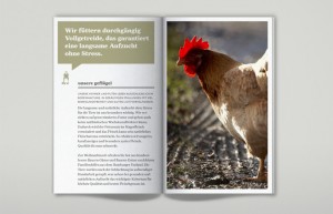
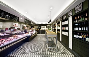
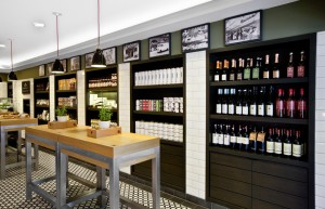
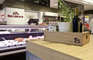
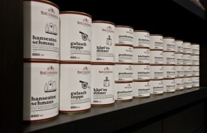
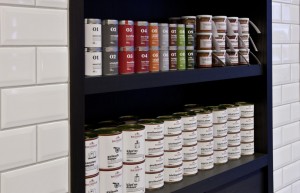
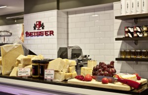
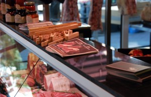
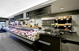
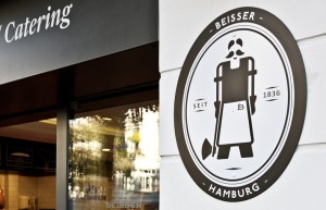
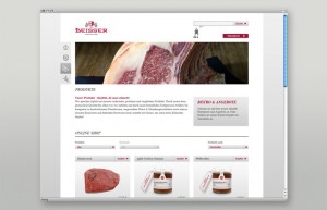
This combined approach is reflected in the overall brand appearance. Tradition is reinterpreted in an authentic and original way and thus reflects the basic values of the brand. Stationery, packaging range and shop design have been completely redesigned to create a new market presence.
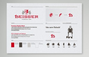
The full set of icons really pulls this branding out from the masses. The strong color palate of red and deep grays creates a strong identity that doesn’t need gimmicks to stand out. Simply great design here.
The project itself is quite extensive.






2 Responses
I found your site today via Proto. Incredible work. When I read the post above, I thought this strong branding was appearing in Hamburg PENNSYLVANIA…I almost died.
Hey Teresa,
Thanks for stopping by. Be sure to follow on twitter @vigor too! Not all of this is ours of course, but I love showcasing amazing restaurant branding work on the blog along side my work as well. Thanks for commenting and be sure look out for my book FIRE IT UP coming out next month! 😀
Cheers!