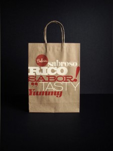
Well, this is more of a food store, but we’ll still put it here. This spanish/latino focused food mart brand was developed by SuperMarket.
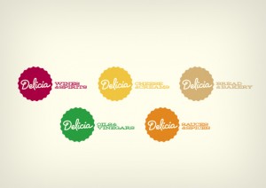
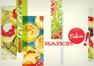
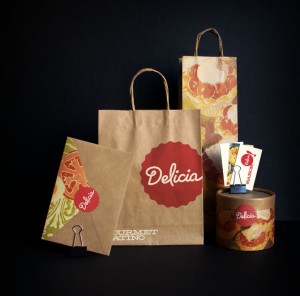
The branding on this project is solid with a consistent type treatment that carries through a autumnal color palate. The logo itself has a semi-retro feel to it reminiscent of an old school sticker call out.
The typeface is well done and the supporting typography really ties the brand together.

