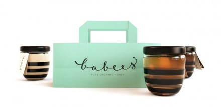
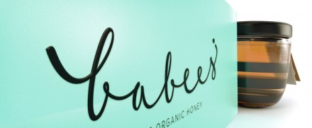
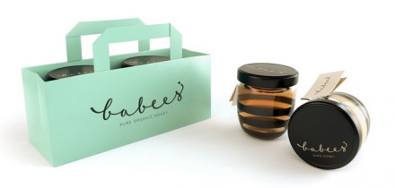
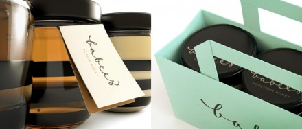
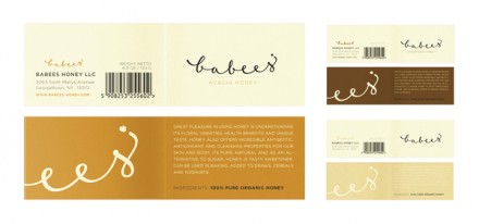
This honey packaging, designed by Ah and Oh, is well done from top to bottom. The actual packaging uses simple lines and a clean script typeface to create an upscale, modern look. The shopping bag design has an unexpected wintergreen color that jumps out. Clean, simple, and impactful. Well done.
The Forktales Podcast™: Interviews with restaurant industry leaders and visionaries
Restaurant and advertising industry headlines and thinking
Reviews of restaurant experiences from around the globe
Reviews of our favorite design, business, & restaurant books
Our favorite typography and fonts
Inspiration in your inbox
Get the latest inspiration in your inbox every Monday morning, for FREE!
"*" indicates required fields

