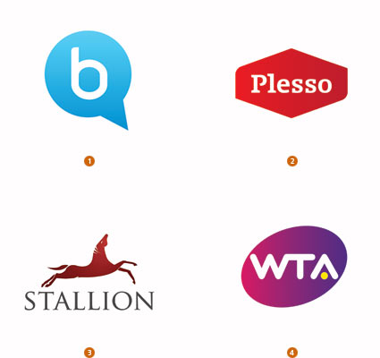
It’s that time of year again. The time when Bill Gardner of LogoLounge reviews the trends seen in logo design for 2011. Color is playing a huge role, much like last year. This time, though, the colors are tinted and more subdued. Beyond that, it’s also noted that the traditional thought of logos is transcending:
It feels like what people believe a logo to be is also becoming more transcendent. A logo is no longer a single piece of flat art. It can be a favicon, an icon, or an entire set of marks that work together to support the team. Its boundaries have become less strict as well. There was a time when most logos could be enclosed in a simple hand-drawn square, circle or similar geometric shape, but now many logos drag outside those outlines. They just don’t want to fit the old mold.


