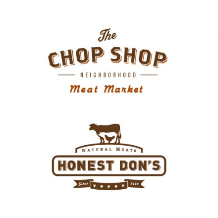
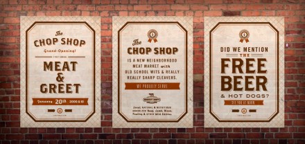
I’ve been in love with this brand identity for a butcher shop since I first saw it. It’s spread across the internet for its on point design, and I just have to add to the list of places it’s been featured. It’s thought out from soup to nuts. All the pieces fit together visually without looking monotonous. Unfortunately, it’s not a REAL location. It started as a real project but fell through. The guys at Ptarmak just finished it anyway because it was too good to drop. I KNOW THE FEELING!


