Omotesando Koffee Branding & Design

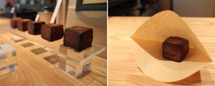
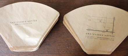
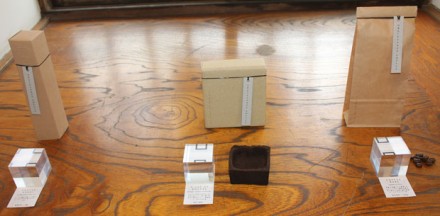
I stumbled across this coffee shop design for a small coffee roaster and retailer in Tokyo, Japan. There wasn’t a ton of information on who designed the actual quaint location, but it’s an amazing study in how minimalism can speak so much louder than bright colors and graphics. The coffee stand is simply designed with black and white typography and lines. It’s simplicity lets the textures, shapes and lighting do the work. Less is more and this is prove. Very zen-like.

If you’re the designer, please comment with your information.


Discuss this Project

Leave a Reply

This site uses Akismet to reduce spam. Learn how your comment data is processed.

The Forktales Podcast™: Interviews with restaurant industry leaders and visionaries

Restaurant and advertising industry headlines and thinking

Reviews of restaurant experiences from around the globe 

Reviews of our favorite design, business, & restaurant books

Our favorite typography and fonts

Inspiration in your inbox

Get the latest inspiration in your inbox every Monday morning, for FREE!

"*" indicates required fields

This field is for validation purposes and should be left unchanged.

Delicious Bits in your Inbox!

Get the latest and greatest content delivered to your inbox for free!

"*" indicates required fields

This field is for validation purposes and should be left unchanged.