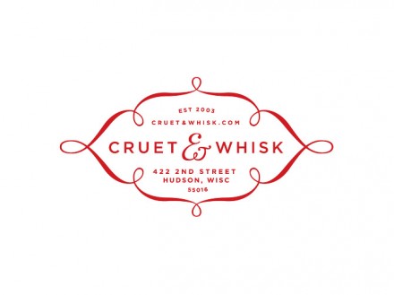
Allison Newhouse (while at Duffy & Partners) designed this small brand identity package for Cruet & Whisk. Not necessarily a restaurant, but a gourmet meals concept. She describes it as “a place that allows people to prepare gourmet, family meals in advance in a warm and welcoming environment”
The image is inviting, warm, and free flowing. The color palate is soft and approachable. The strong, clear typography mixes well into the design without being lost. Love the little toothpick filled matchboxes.


One Response
I have to agree with you, the toothpick filled matchbox was my favorite as well!