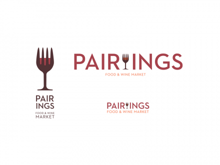
Another lovely brand identity design by Spunk Design Machine. This time for a food and wine market called Pairings. The mark is immediately identifiable, strong and unique making it the epicenter of the brand. The colors are vibrant tones of earthy colors. Excellent typography and great delivery throughout the elements really ties this one together.
The Forktales Podcast™: Interviews with restaurant industry leaders and visionaries
Restaurant and advertising industry headlines and thinking
Reviews of restaurant experiences from around the globe
Reviews of our favorite design, business, & restaurant books
Our favorite typography and fonts
Inspiration in your inbox
Get the latest inspiration in your inbox every Monday morning, for FREE!
"*" indicates required fields


