It may not have been national news but when Varsity Donuts opened not too long ago it had a twinkle in its eye and a stolen logo. Little did the owners know that the designer they hired actually stole the logo from a Dunkin Donuts spoof design for and posted on a renowned design blog, by Matt Stevens. The way the situation was handled was perfection.
Upon finding out about the ripped off logo, Varsity immediately reached out to the designer with a sincere apology. Then, they did the unexpected. They hired the original designer, Matt Stevens, to develop and design their identity. That’s how you handle the situation right!
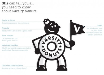
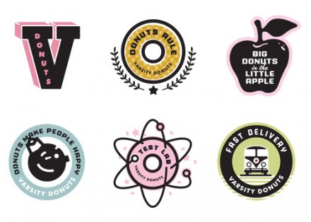
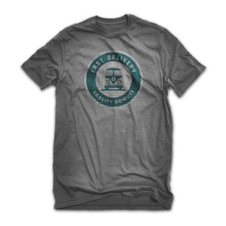
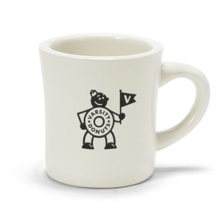
Here’s the work Matt produced for Varsity. Very retro in style for a product that is truly retro: Donuts. I hear their pretty damn good too!






One Response
That’s a pretty rad story. I love how unconventional the final branding is. Not too many people would go that route. But it works.