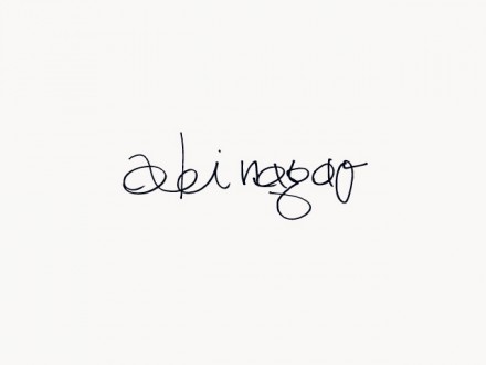
Here’s a huge update for Friday. This upscale restaurant’s identity was developed by Commune. The brand is absolute luxury through and through. From the handwritten script logotype to the thick “slash” brand mark, the restaurant’s brand is simple, poignant, and clean. I imagine the cuisine follows suit. I especially love the black washed wood for the menu holder. The business cards take a new direction with a unique fold that mimics the brand mark. The entire brand identity design was thought out and nothing left to chance. This is the epitome of a solid branding implementation.


