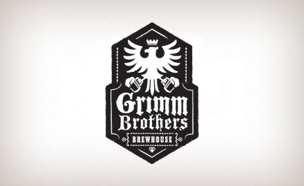
In the spirit of Halloween I’m posting up the work for Grimm Brothers Brewhouse by the guys at Ten Fold Collective. It’s an amazing brand identity and packaging design initiative featuring visual metaphors from the Brothers Grimm fairytales. The identity is black letter and Germanic in nature supported by modern illustrations that look similar in style to Christopher Moore book covers. The entire package is fresh and new. It has that level of wit and execution that make it stand off the shelves. Well executed.


