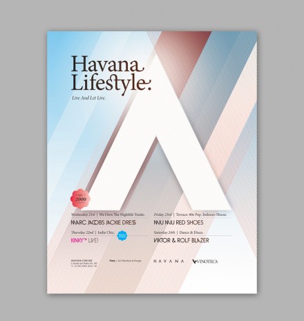
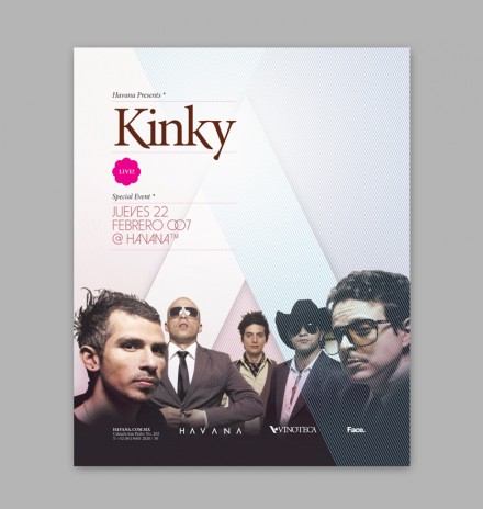
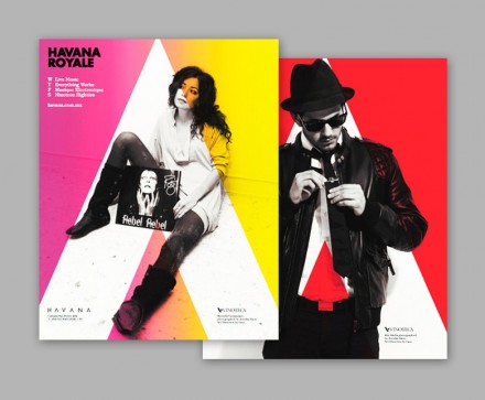
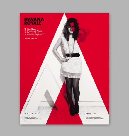
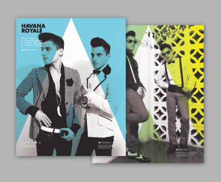
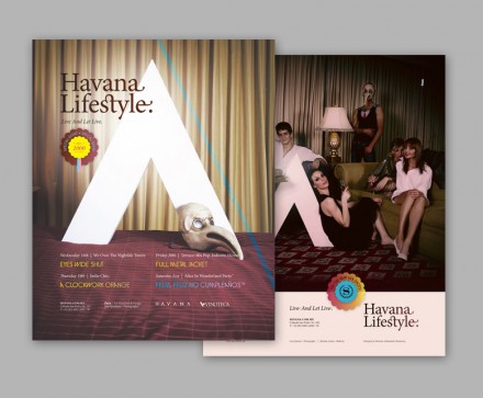
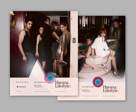
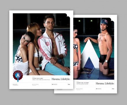
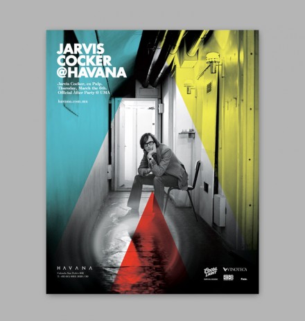
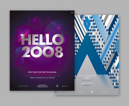
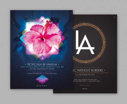
Club fliers are usually extremely gaudy and use a typical modern typeface that you’ve seen everywhere else. I came across these fliers/posters for the club Havana and felt they were such a breath of fresh air. They have a strong focal point and message. They aren’t afraid to employ a page hierarchy. They have white space that allows the piece to breathe and communicate. Great work by Face.

