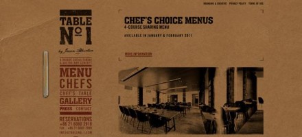
I honestly thought I had covered this work before, but after searching through my own blog, realized I didn’t. Foreign Policy Design Group put together this quaint, but amazing identity for Table No. 1. Marked by a witty business card design (that folds into a table), the restaurant’s identity is decidedly rustic and rough; it’s raw. It’s congruent with the vibe and experience as well as the cuisine. This one is dead on. Thanks to CreativeSprk for reminding me that I didn’t cover this.


One Response
This is very lovely. Is it the rooftop on the last picture?