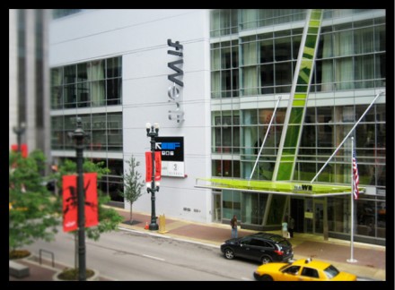
Although it’s a hotel, the entire entity houses a restaurant and the brand that surrounds it is very well done. It ties the experience together from soup to nuts. Boy Burns Barn has brought the brand’s identity to the forefront throughout all touch points. The chartreuse is vibrant and modern. The zig zag pattern is sewn throughout the materials. All bundled up, it’s cohesive and strong.
The Forktales Podcast™: Interviews with restaurant industry leaders and visionaries
Restaurant and advertising industry headlines and thinking
Reviews of restaurant experiences from around the globe
Reviews of our favorite design, business, & restaurant books
Our favorite typography and fonts
Inspiration in your inbox
Get the latest inspiration in your inbox every Monday morning, for FREE!
"*" indicates required fields


