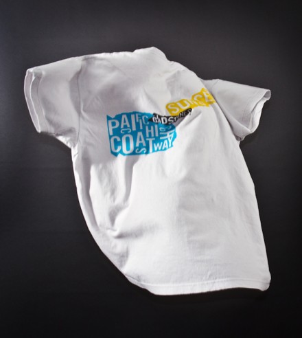
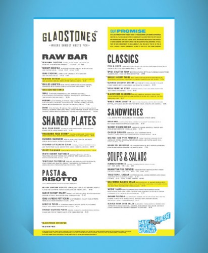
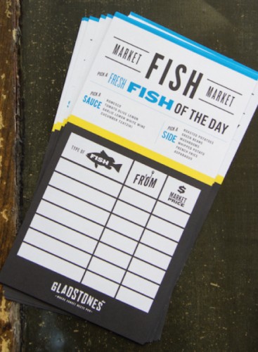
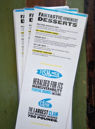
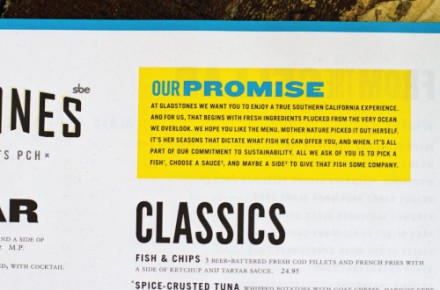
Found this restaurant brand on Art of the Menu. Designed by Mistress. The Gladstone’s restaurant logo nods at the Hollywood sign’s typography then builds from there with fun use of type and graphic shape to create a unique identity for the restaurant. I love the bright yellows mixed with cyan blues then supported with black. The secondary logo places Gladstone’s geographically in a map format using the type, once again, in a unique way. Very well done.


