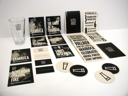
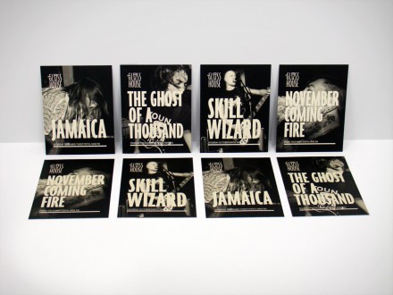
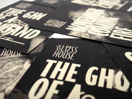
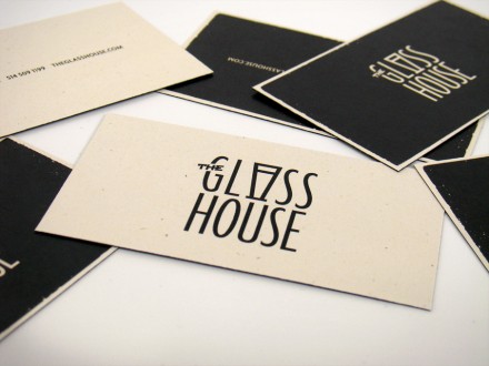
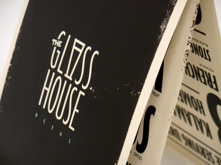
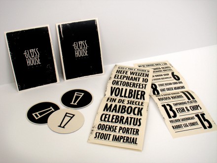
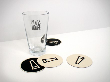
The brand for the bar and restaurant, Glass House features high contrast color palette and black and white photography. This gives it a sort of nostalgic and classy feel. The typography for the restaurant’s logo is well done incorporating the glass mark in the actual type. Catherine Bourdon, the designer, explains her direction:
Branding for a restaurant/bar/venue specialized in homemade beers, tasty snacks & live music. Consisting mainly of seasonal menus and live show flyers, this one color identity on colored stock allows for cost effective reproduction and recognition.
By infusing a little bit of grit and copy machine imperfections to contrast its simple and sleek aesthetic, the Glass House’s new look still manages to take a nod at the venue’s punk and hardcore roots.

