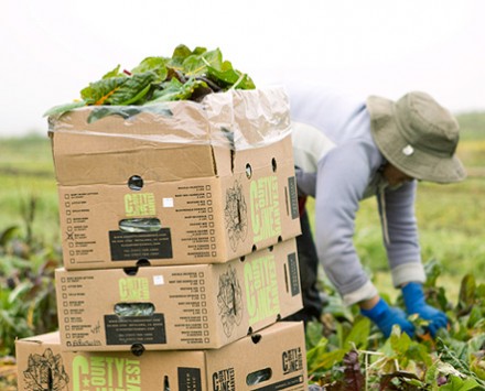
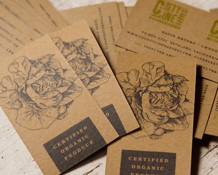
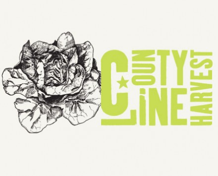
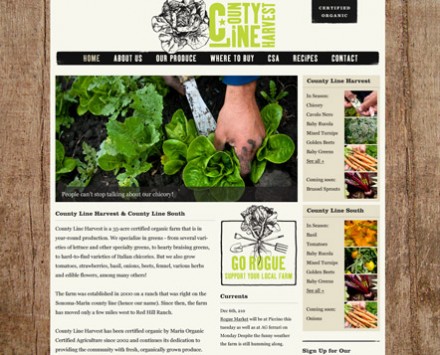
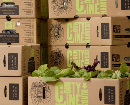
The branding for County Line Harvest, conveys organic and natural while still renaming vibrant. The identity is marked by a bright, lime green as the epicenter of the brand’s color palette. Typographically it’s earthy and rustic. The packaging is well designed and definitely stands out. Designed by SEED, who explains the purpose:
County Line Harvest, an organic farm that focuses on specialty greens and has locations in both Northern and Southern California, needed an identity that was versatile enough to represent both County Line Harvest, their farm in the north, and County Line South, their farm in the south. Logos were needed for both farms that could work together but also apart. Their pop-up ‘Rogue Markets’ also needed to be incorporated into the brand family. We developed their entire identity and rolled out a website, produce boxes and marketing materials.

