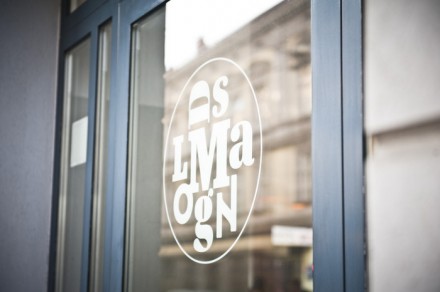
Mangold’s, a vegetarian restaurant, underwent a huge renovation. Part of the renovation was rebranding the restaurant and updating its image. The people at Moodley handled the job of refacing Mangolds to visually tell a tale of “cool” vegetarian food. The new logo is a mixup of the letters in Mangolds. I’m not 100% on its interpretation though as it’s hard to read, but once understood it’s actually new an different. The rest of the identity, however; plays out very well and creates a fresh, crisp look for the restaurant. There are ton more photos at the Moodley site, but here are a few to view.


