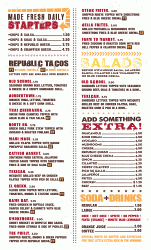
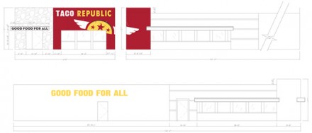
The brand identity design for the restaurant, Taco Republic, boasts a handmade, street-style vibe. With strong reds, yellows, and browns, mixed with handdrawn typographical treatments, the branding captures the temperature and flavor of this tex-mex style taco joint. I love the heraldry in the logo treatment as seen on the shirt and the patch. I’d love to see some takeout packaging here to extend the brand further. Designed by Nosh Creative.


3 Responses
Outstanding except for one little detail, which is probably just my designer head being overly picky.
I love both logos, my problem is – there’s no real connection between the two. Either works as a stand alone, but if i see say a menu with the crest, then shirts with the “R”, or vice versa – i start to think – which is the brand?
It looks like one of those “client loves both concepts” situations, which is fine. I’d have kept digging until one or other was chosen, thereby avoiding that little brand confusion.
As always – great find, and great review!
I hear you. The correlation would be the typography and the wing element, but I agree it’s too obtuse. Maybe one should be in patch format, t-shirt design only, something secondary.
Hey guys,
Just chiming in for some clarification. The “flying TR” was actually developed after the main shield logo as the to-go icon. The to-go icon is only on the to-go menu (pictured with the in-store menu), the back of the work shirts and the to-go bags (not pictured). It also has the same wings/texture that is in the shield logo. I hope that explains things a little better. Cheers.