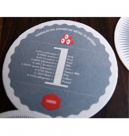
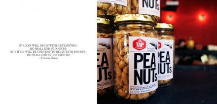
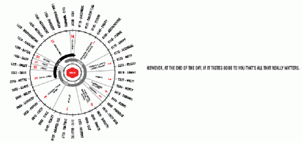
Tap jumped out at me from the start. Not just because of the graphic design, but also because of the production. It’s rare that a restaurant will take printing this far (see menu design.) The menu is a beast with full color graphic elements, and sheets that are interchangeable – a big plus for any restaurant that changes its menu seasonally. The graphic elements all seem to follow an infographic-like feel with diagrams and charts. Definitely something new and different. And, hey, it’s here in Atlanta so maybe I’ll be stopping in this weekend. Designed by Boy Burns Barn.


