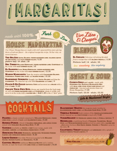
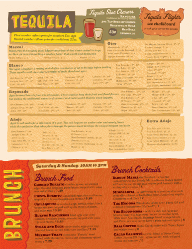
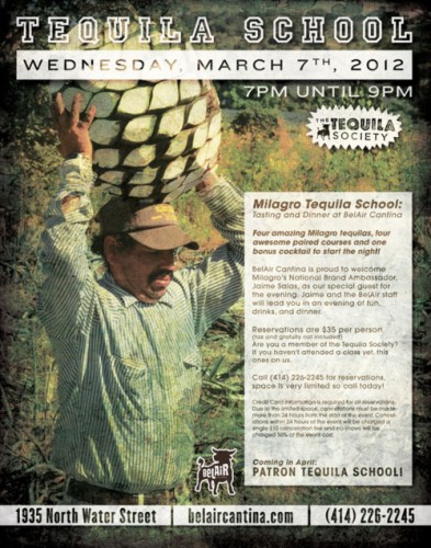
This phenomenal little cantina has a brand just as awesome as the physical location. Hand-drawn typography and a gritty brand style gives this place a rustic Mexican meets artsy vibe. I love the building and how everything from the logo to the posters to the website all have this urban decay kind of vibe. Great restaurant brand found via Art of the Menu. I think Happy Eyeballs did the design work, but if you’re the designer please comment so I can update the credit.


