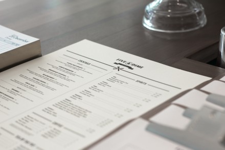
Five & Dime Eatery is a brand that’s no frills and no extras. It’s simple from the logo throughout the other brand touch points. With a black and white color palette and solid design layouts, the brand is strong and steadfast. Great iconography and hierarchy of design makes the restaurant’s vibe a classic. Designed by Bravo Company.


One Response