The owners of former restaurant The Reserve knew they needed to make a change if they were going to draw people in from Baltimore’s Federal Hill neighborhood. Being just a few blocks away may seem like it’s not a big deal, but when it comes to choosing a dining experience it can be a deal breaker. They called in Chef Cyrus Keefer and Vigor to turn the tired restaurant brand into a reinvigorated experience. (Designed by Vigor, a restaurant branding firm)
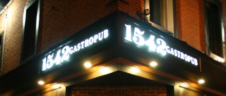
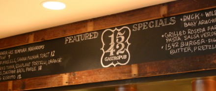
After reviewing a gallery of images of the space and a little research on the market, Vigor began the design of a restaurant logo that would capture the experience visually. A combination of classic typography with a traditional graphic treatment seemed to make this look like an upper echelon experience, but made it also look more contemporary (oddly enough.) With the restaurant’s logo and identity started, Vigor began fleshing out the design of the key brand touch points.
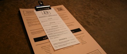
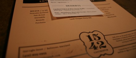
The menu design used a slab of wood, stained deep dark brown and a steel bulldog clip as the holder. This gave it a rustic, earthy and trendy feel. The menu layout continued the graphic treatments and typography making the brand’s vibe increase in its strength.
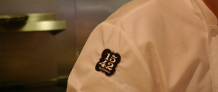
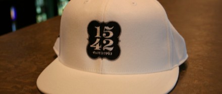
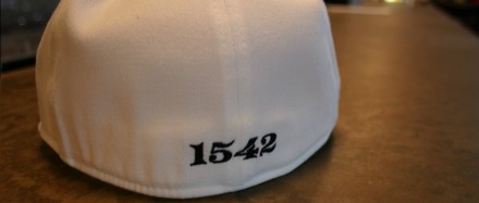
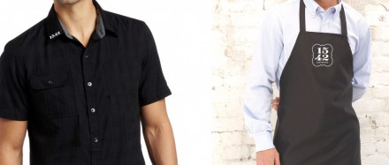
The restaurant’s logo translated well into embroidered treatments in key areas of apparel including chef coats, ball caps, aprons and shirts for service staff. It also sets up the ability to design t-shirts for sale to consumers increasing the reach and awareness of 1542.





One Response