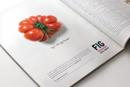
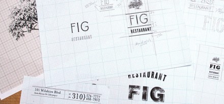
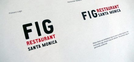
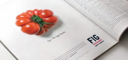
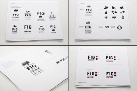
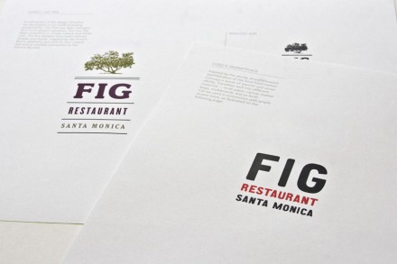
Not to be confused with the other FIG Restaurant I blogged about awhile back, this one is designed by Love & War. The identity for FIG s strong with black, red and white as the primary color palette. This allows the imagery and the design to speak, and build the brand’s visual message. The ads, website and other touch points all support a message of simple, fresh food with great flavor.

