They say “a picture is worth a thousand words,” and although that’s subjective and hard to prove, what can be said is, “pictures are worth a few thousand bucks, per day.” That’s what we learned by some excellent experimentation with menus for our client GRYLT, in Honolulu. This post is a tale of how we increased store sales exponentially by simplifying a menu and adding photos.
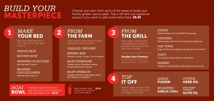
This was the original menu we designed for GRYLT in 2011. It’s layout simple. It’s look, clean. It explains how to order and how to create a platter. Simple. 1, 2, 3 4. The result? It worked. People ordered, but not without a lot of questions and confusion.
What causes confusion?
Bottom line: laziness. Or, more positively, time has been pinched and strained. People want things now. They don’t want to think. At all. So, that means we had to simplify. Let’s add some photos to make it easy for those who don’t want to think about things.
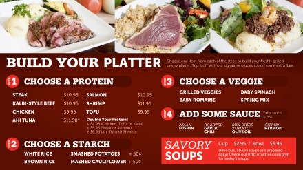
This rendition was launched in summer of 2012 on digital menu boards. The result? Higher sales, but still some confusion.
Where’s the confusion here? Well, the images aren’t labelled and the menu still requires the user to read and understand. That takes time, and, like I just mentioned, time isn’t invested any more. We need simpler.
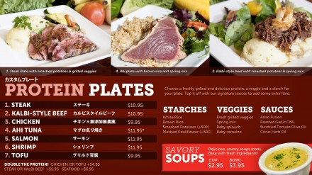
So, we labeled the photos; made them bigger, and added some Japanese translation to cater to a secondary market. We also removed superfluous descriptions and the steps. Now, the customer can order their platter. The starches, veggies and sauces are questions asked by the line prep so the customer doesn’t have to think about it. Now, they can just pick a number or the name of a protein and their on their way. (We also added a photo of the soups to increase upsells.)
The result? Even more sales. People found it simpler and the secondary, but rather large, market came more often. However, we still saw people walking away. It was complicated for them. Too much to think about. Too complicated. The problem is we can’t remove anything else. We’re at the bear minimum of what we need to say. Still, numbers don’t lie so we gave it a shot and dumbed down the menu to it’s simplest form.
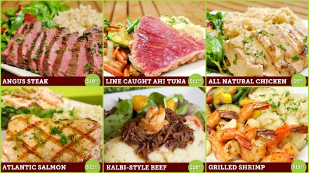
The day we launched the simplified menu, sales tripled. The second day? Tripled. And they’ve stay that way. No where on the menu do we show starches, veggies, or sauces. We simply ask while on the line. Customers see a picture, they point, they buy. Simple. As simple as it can be and the numbers don’t lie.
Conclusion: An all photograph menu board isn’t design-pretty. It’s pretty ugly to designers, but it quickens the amount of time to order; reduces anxiety about what the customer is going to get; and makes the decision making process as easy as it possibly can be. All amounting to more revenue.
What are your thoughts on the menu? The design? The results? Chime in.


5 Responses
This is a very interesting case study. And the results are disheartening. Dumbing things down because people don’t have time to read a menu. It’s not Dostoïevski! From all my experience in studying, designing, and reading menus, is that adding photos to a menu is a risky business. What happens when the dish doesn’t correspond to the photo? You set things up for disappointment. Cook staff can’t reproduce those photos (if they are done properly to look appetizing).. Best to opt for descriptive food labels (see Wansink et al.) But then people would have to actually read. And we can’t have that! Argh.
You’re telling us! We loved the typographic approach, but couldn’t argue the results. They were instantaneous, too. Boom. More sales when pictures were shown. Part of it is due to a language barrier caused by the islands, but that’s not all of it.
This food looks yummy