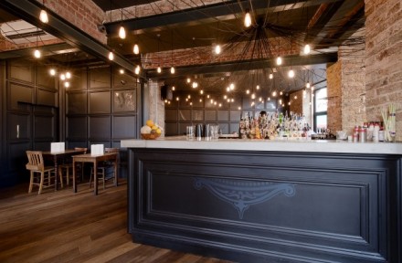
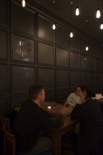
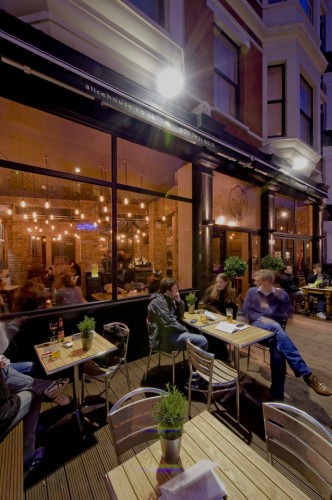
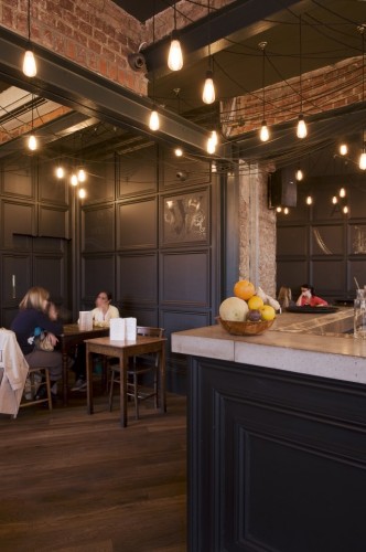
Designers need to always remember to edit out some of the frills of their design. A “less is more” approach is usually going to work better than a presentation that pops so much it induces headaches. 44th Hill’s design of The Alice House bar nails this approach and gives northwest London a cozy bar that fits into the neighborhood. The interior of the Alice House utilizes the original frame and brick work to tip a cap to the past while keeping an eye on interior trends such as minimalist exposed lighting and distressed seating.


