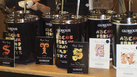
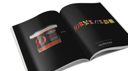
Soup doesn’t always have a lot of flair or pizzazz. In fact, it sometimes isn’t all that impressive. Instead of a meal, it’s frequently thought of as something easy to make and mild to eat when you’re sick. The design work Lambie-Nairn gave Glorious! and their soups helped the soup brand position itself as something more than just old-fashioned soup that hasn’t changed or grown over the ages. The use of a letter of the alphabet to symbolize the dominant ingredient in each creative soup is smart, but making each individual letter unique to itself and in some way reflect the flavor profile of the soup is really smart. With a smart rebranding from Lambie-Nairn, Glorious! is one of the unique leaders in the soup category.


