A Not-So-Serious Modern Public House

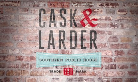
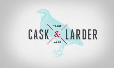
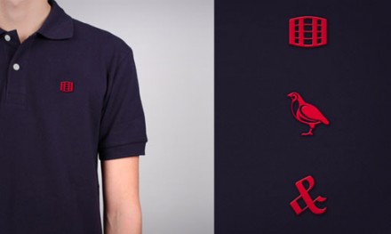
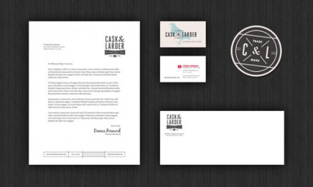
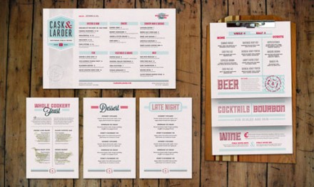
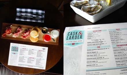
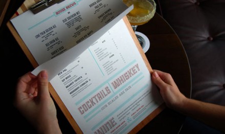
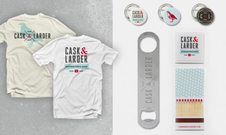
Cask & Larder sells itself as a public house, paying homage to the traditions of such a place in everything they do. One difference with Cask & Larder is that while they’re traditional with what and how they serve, their modern approach to branding turns the restaurant into an establishment that can appeal to a variety of people. Hatchet Design did the branding for Cask & Larder and they tied those two sensibilities into a neat package. Combining design elements popular from decades ago, Hatchet presents a traditional place that is up with the times. The resulting branding uses popular color schemes like sky blue and bold red to make Cask & Larder seem like a fun place that honors tradition without losing its edge or taking itself too seriously.

CL01

CL02

CL03

CL04

CL05

CL06

CL07

CL08

Discuss this Project

Leave a Reply

This site uses Akismet to reduce spam. Learn how your comment data is processed.

The Forktales Podcast™: Interviews with restaurant industry leaders and visionaries

Restaurant and advertising industry headlines and thinking

Reviews of restaurant experiences from around the globe 

Reviews of our favorite design, business, & restaurant books

Our favorite typography and fonts

Inspiration in your inbox

Get the latest inspiration in your inbox every Monday morning, for FREE!

"*" indicates required fields

This field is for validation purposes and should be left unchanged.

Delicious Bits in your Inbox!

Get the latest and greatest content delivered to your inbox for free!

"*" indicates required fields

This field is for validation purposes and should be left unchanged.