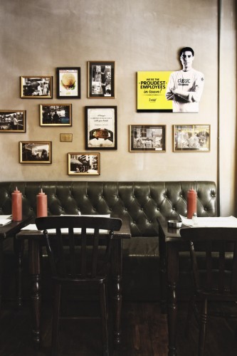
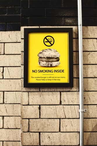
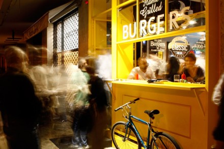
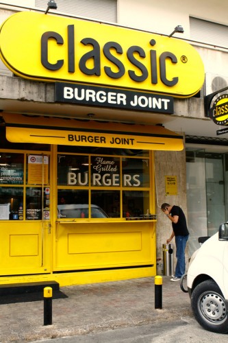
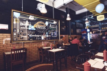
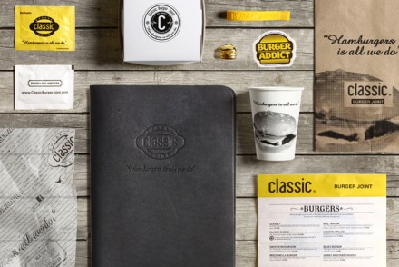
Sometimes a name can be so common it’s borderline brilliant. That’s the case with Classic, a burger joint in Lebanon. Classic offers the classic hamburger in a variety of ways and while in America we’ve got almost enough of that, it’s still a growing food in other areas of the world. What Classic, designed by Wonderight, has accomplished is a place with a vintage feel that isn’t old, uninspired or stale. They opt for a simple black and white palate and use their simple menu to their advantage, creating branding that reminds every potential customer that they serve a quick, easy, painless and completely delicious meal without a lot of pretense. This is a great example of what can happen when you stick to the facts and use your branding to tell your simple story without a lot of embellishments or details.
53016ebc098cf42dc4df7c06c4ae9f26

8a5f2e28cc59954624d920acbf0e489c

44073cff90dc05be23061e208ec07229


8870290bdd6cb69402c8ab73487794b2

b513637419f1798a7bf6eff9822d845a

d8a8bd0279dc7c6d4c05a348c9ca9b7b


Discuss this Project

Leave a Reply

This site uses Akismet to reduce spam. Learn how your comment data is processed.

The Forktales Podcast™: Interviews with restaurant industry leaders and visionaries

Restaurant and advertising industry headlines and thinking

Reviews of restaurant experiences from around the globe 

Reviews of our favorite design, business, & restaurant books

Our favorite typography and fonts

Inspiration in your inbox

Get the latest inspiration in your inbox every Monday morning, for FREE!

"*" indicates required fields

This field is for validation purposes and should be left unchanged.

Delicious Bits in your Inbox!

Get the latest and greatest content delivered to your inbox for free!

"*" indicates required fields

This field is for validation purposes and should be left unchanged.