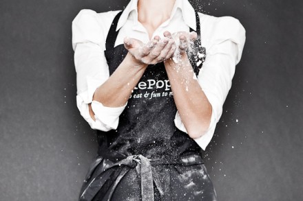
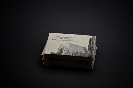
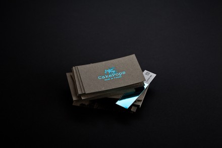
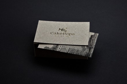
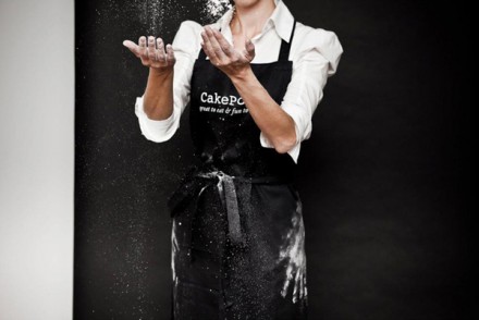
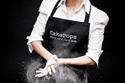
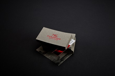
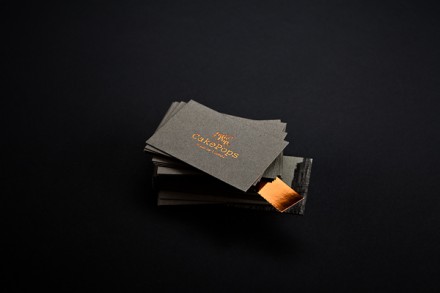
Right off the bat what I notice about Vienna-based Julie Pop Bakery is the classy element they bring to a highly popular and trendy treat. Designed by Bureau Rabensteiner, the images they use of a black-apron clad Julie Pop baker provides the surprising elegance and the flour as prop in the images creates a nice balance of fun and free-spirited. It’s all a little unexpected, but that’s allowed in branding. I like how the actual logo is relatively simple, but the flashes of color used resonate with the colorful varieties of their cake pops. In a world of black and white, using color makes an impression and a statement. This is yet another example of a foreign brand using an American feel though they stay true to their own heritage with local imagery of homes and business facades on their business cards. Independent and elegant with a whimsical sense of joy is how I’d describe Julie Pop and that’s pretty consistent with the product itself.

