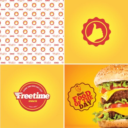
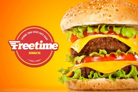
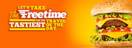
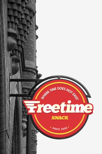
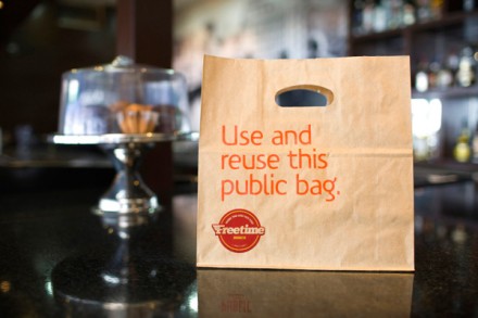
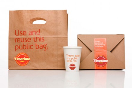
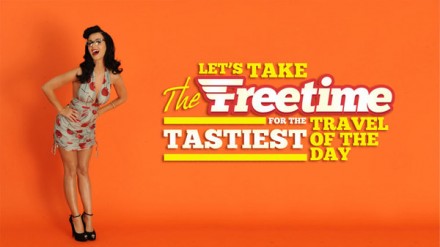
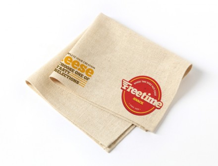
We should all take a lesson from preschool and daycare kids everywhere: the world needs snack time. That’s of course the belief of Freetime, a Lebanese fast food snack joint and with their rapid growth overseas came the need for a rebranding effort that was as strong as their offerings. What I like about the logo is the implied speed of service. I don’t personally know how quick this location is or even if that’s part of their primary objective, but the logo is clean and has the movement necessary to provide a sense of speed of service. While I don’t think it’s necessary, Freetime’s brand has an American feel to it and that’s something I’ve noticed a number of times while studying branding over the last few months. Here’s another recent post of a foreign concept using American aspects in their image. They also use red and yellow, a highly familiar color combination not just in America, but all over the world. It’s a smart technique on behalf of Freetime and designer Joe El Helou and it evokes a friendly and approachable vibe, perfect for this particular offering. I also like the use of multiple slogans and descriptors throughout the branding. All the remarks provide Freetime with a sense of quality and fun as well as an idea that time at Freetime will be the best use of time in one’s day. That’s a strong remark, but bold endeavors in branding often pay off quickly.

