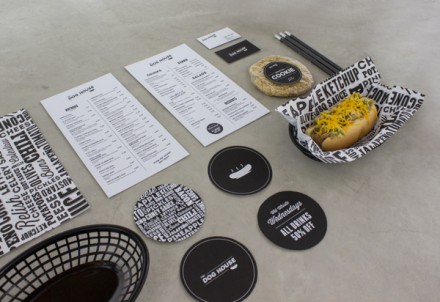
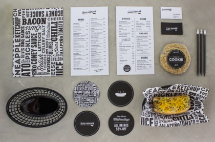
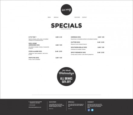
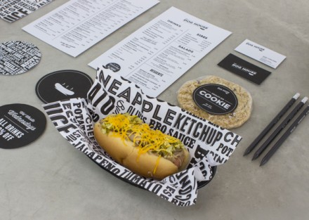
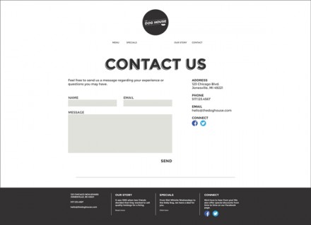
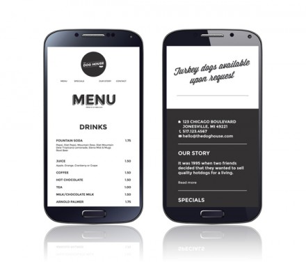
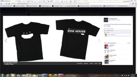
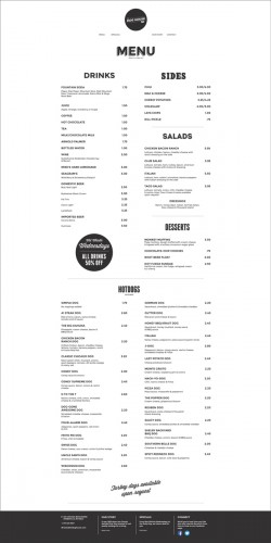
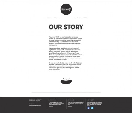
Does it say something about my mindset regarding relationships that I hear “dog house” and immediately think of bickering couples? That’s my initial association with that phrase, but that’s not entirely terrible and it kind of illustrates some of the theory behind a good name, and The Dog House, despite that association, to me is a good name. There’s enough in the visual accompaniment of the name and the logo to quickly take me away from that association. While this is only a proposed rebrand effort for a hot dog restaurant, I like where the designer Lauren Prueter‘s head is at. Of course the name can have multiple meanings and it does, but smartly there’s a steaming hot dog added in to the logo to remove all doubt that this restaurant does in fact serve hot dogs and not just house embattled boyfriends and husbands. I love the timeless feel the black & white color scheme gives the project and Prueter makes a curious, but astute decision for the client’s website. In lieu of a splashy and active landing page for the site, she puts the menu front and center. Her reasoning is the menu is the most coveted piece of information on a restaurant’s website so why not make it readily available and viewable? Sound logic if you ask me. I like Prueter’s keep-it-simple approach and I love the clever use of a phrase that can have multiple quirky meanings.

