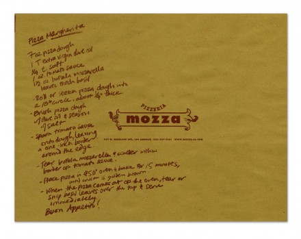
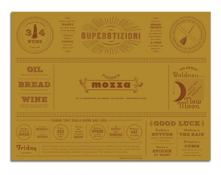
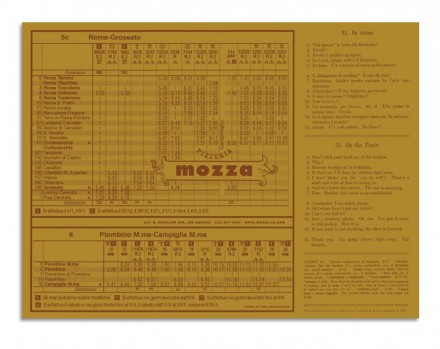
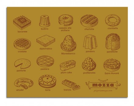
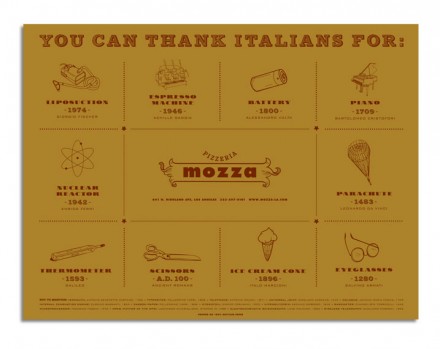
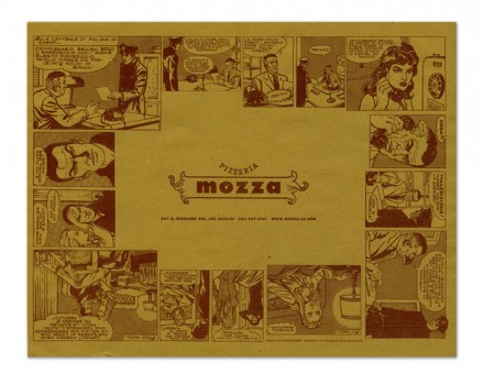
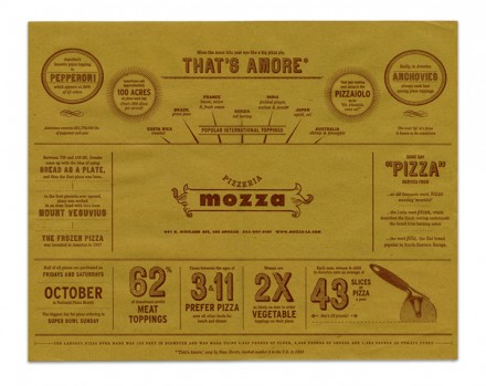
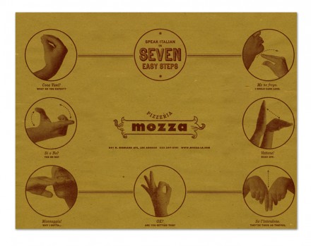
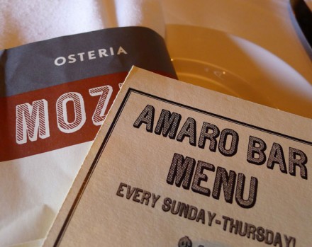
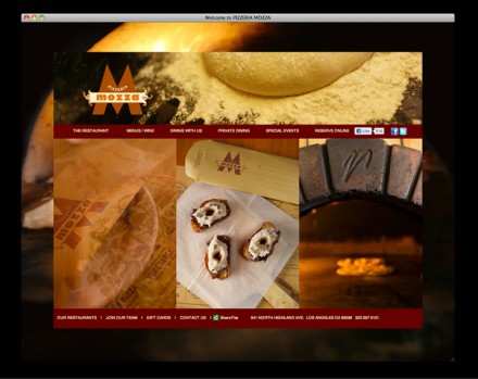
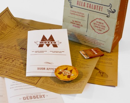
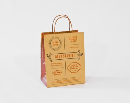
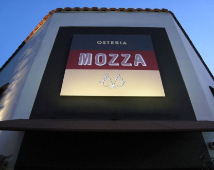
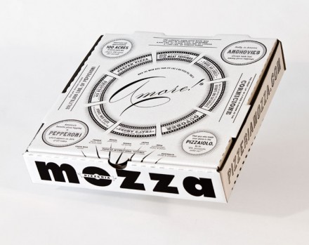
Before we get too far into the Pizzeria Mozza branding by Memo, I want to first direct you to the Pizzeria Mozza pizza box in the collection of images below. Take a look at it and tell me if you don’t think the new Domino’s Pizza box doesn’t look quite similar. You can’t say it doesn’t. I’m not saying Domino’s lifted the design of their new box from Mario Batali’s pizza concept, but it at least served as the inspiration. It’s quite an accomplishment when the good ideas and design of a brand begin to be mimicked. Memo has worked with Batali before on other resturants and since Batali’s places are typically Italian in nature, the design of them is often following in a similar direction. With this pizza venture they decided to depart from that norm all together and discover modern and creative ways of representing Italian vibes without using many of the same elements we’ve seen before. The completed design uses off-beat colors and fonts but in a big way, capturing the personality of Batali and his food. Much of the work is strong and masculine, but the place mats counter that, appearing like works of art when you sit down to begin a meal. They feature different designs, all with a variety of focuses from foods to learning Italian. They’re busy and create some interaction with the guest. The whole concept is bold and presents a completely new way to brand Italian.

