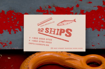
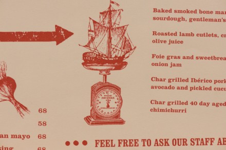
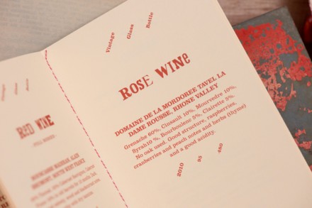
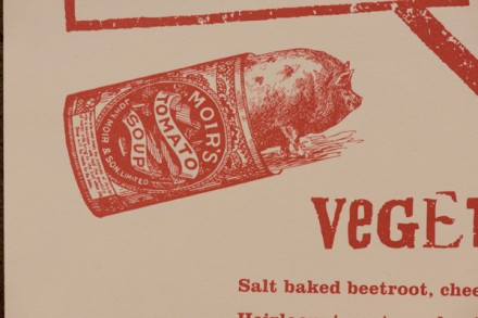
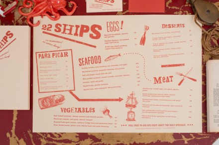
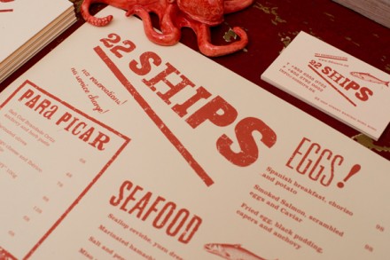
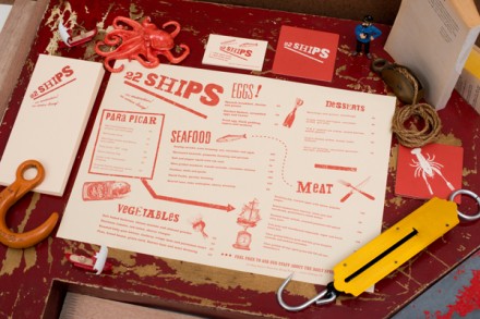
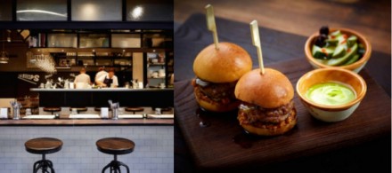
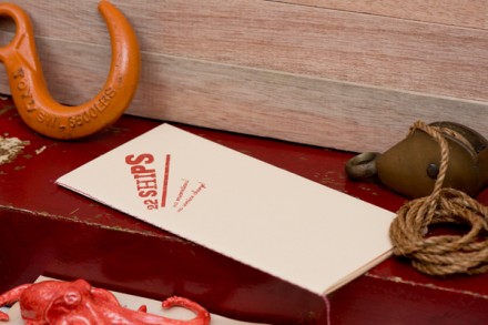
It’s not uncommon for a brand-making firm to use local history to influence the development of a local brand and that’s what we see here from Foreign Policy in their work for Hong Kong’s 22 Ships. Inspired by the restaurant’s location, 22 Ship Street, the brand reflects the influence of the sea on the area. 22 Ships sits among abandoned buildings and what was a once a pier, the area’s connection to the sea. Seafood is a part of 22 Ships’ menu, but other non-sea-related food items are available as well. There’s a modern edge to the branding so it’s not so over-the-top seafarer. The logo and accompanying branding has a tilted appearance and a lot of arrows and lines throughout. I do love the sea-weathered look they gave all the brand collateral so there’s a sense of history here without being completely reliant on it. Culturally, I think Foreign Policy gave 22 Ships a brand that can fit in because it’s not way out there in terms of imagination, but it is also likely unique among the offerings in the area so it stands out, which is pretty important from a competitive brand aspect. I feel like the overall image is heavy on red, but the interiors balance that out a bit and red is actually hardly present in their slightly upscale presentation.

