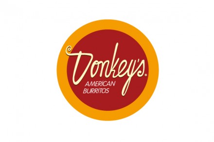
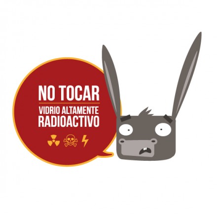
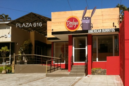
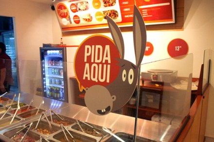
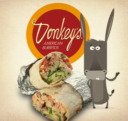
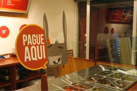
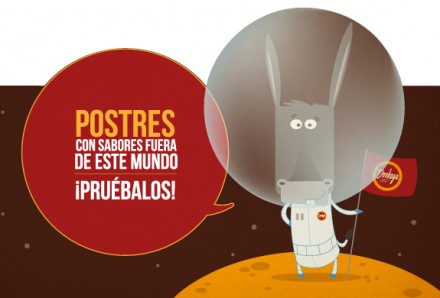
Donkey’s is a burrito house in El Salvador serving American-style burritos. There’s so much to like about this brand, but let’s start with the name. Suitable; clever; sufficiently flippant. From the logo on down, this entire brand, by designer Junior Arce, is well-planned and well-executed. I love the circle-in-circle badge style brand mark with the homemade typeface, a cursive script that is relaxed with a little curlicue to start the D. The donkey characters are great and they’re modern enough to capture a new wave of children and their imaginations. They’re fun and they’re funny, a good combo in branding. They’re appealing in other ways and they capture an adult audience as well because of their phrasing and the less-than-cartoonish way they appear. The interior and exterior appearances of the restaurant is consistent with the entire brand vibe created here. It presents a clean and quaint look without losing the modern appeal. From the top down this is a thoughtfully-considered brand that communicates a clear message through all of its lines of communication.

