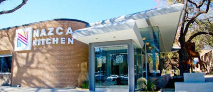
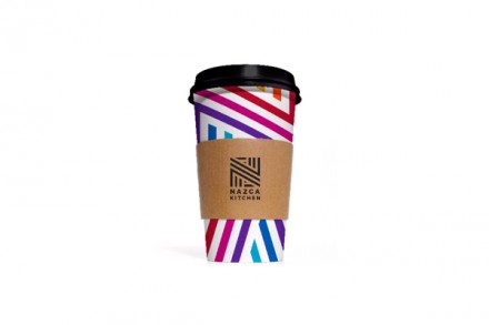
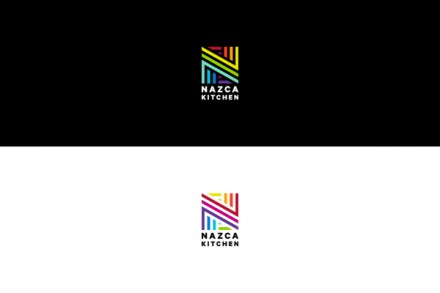
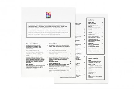
I don’t claim to know much about South American heritage, folklore or cuisine, but Tractorbeam learned all about it as they considered options for the South American restaurant Nazca Kitchen. Their task was simple: present Nazca as a restaurant of the country with branding that reflects such a boast. Like I said, I don’t know much about South America, but from my limited perspective, it looks like they did a nice job. Color is a major aspect of the “color” of the country and it’s reflected in the linear and highly colorful logo created for Nazca. Instead of going for a vintage or historic perspective, they opted to bring these characteristics into the modern world in Nazca’s branding. The brand’s iconography is also influenced by folklore and customs, but it maintains that linear feel they established with the logo. I love the simple use of colors here and while it’s a rather simple branding project, it hits with its active and colorful logo and resulting brand vibe.

