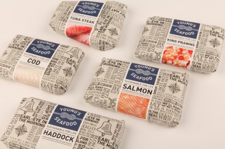
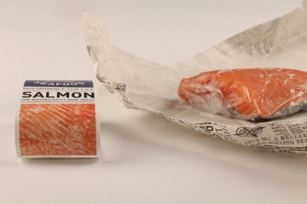
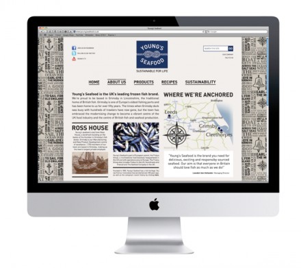
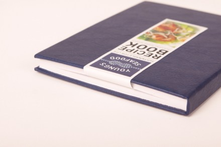
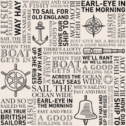
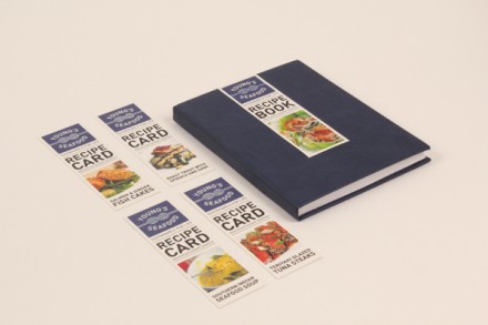
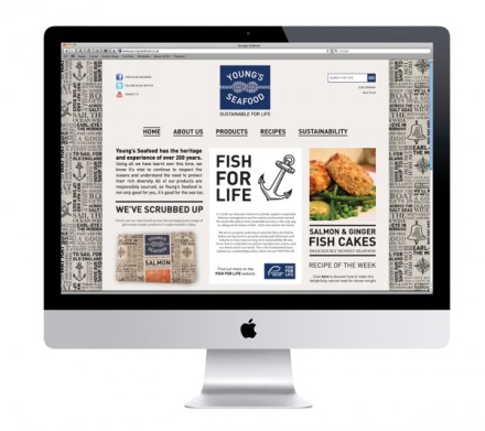
It’s always interesting to take a look at what imaginative ways designers could rebrand an existing brand. That’s what we’re doing with Emily Myers’ modern take on 200-year-old British seafood producer and distributer Young’s Seafood. First, she establishes a new logo, a confluence of nautical imagery and the durable, long-lasting nature of the brand. It gives them a new look with themes of old and becomes something very simple, yet highly recognizable. The rest of the branding works around the sailor themes, including a tile pattern with sea songs and sayings. What I like best is the reimagined packaging, an important aspect since much of what Young’s sells comes off the grocery store shelf. The packaging with the tiled patterns is reminiscent of the way fish was once wrapped in the UK: with newspaper. The newspaper-like wrap is eye-catching, and again that’s the kind of thing you want on a store shelf. I like what Myers’ has done here, taking major elements in the brand and giving them a fresh and memorable presence.