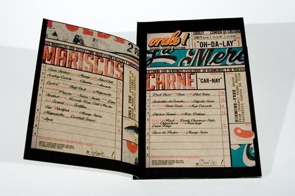
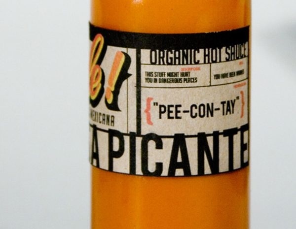
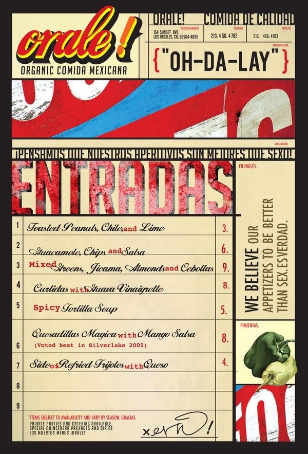
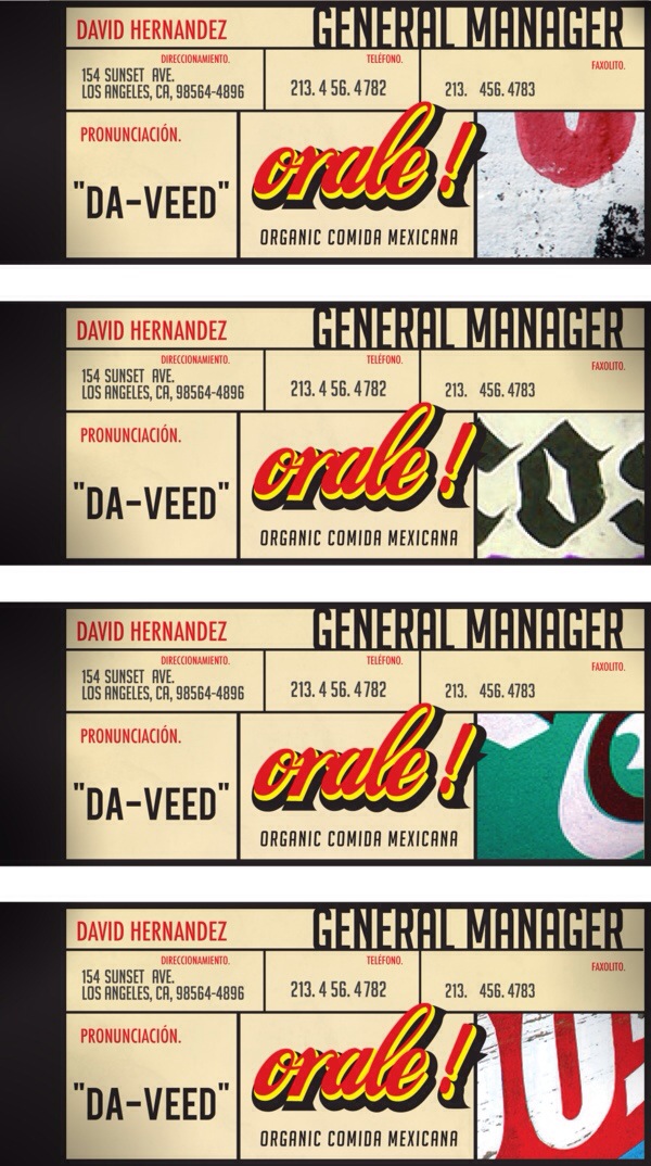
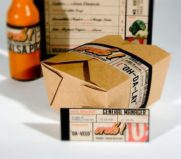
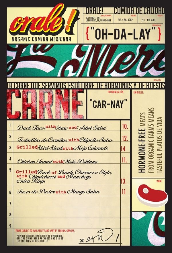
I’m always on the lookout for branding of restaurants whose category is highly prevalent in the marketplace. I like to see jobs, especially for these more common style restaurants, that have personality and a new look or take on what’s already been done. Orale! is one of those places. It’s an organic Mexican eatery in Los Angeles designed by Eric Hollings and I want to start with the name. “Orale” is a common Spanish greeting, not unlike “What’s up?” or “How’s it going?” in English. The word also has its place in slang, typically meaning a boisterous affirmation such as “Hell yeah!” I like what they’re doing with all of that. The visual identity has a strong, strong graphical element and Hollings has really done some attractive work. The bones of the vision starts with the traditional diner check appearance, with its graphical lines and boxy appearance. Inside that, Hollings pieces together an entire look that feels vintage with a strong comic book vibe. The brandmark comes with a bold appearance and the exclamation mark is present, as it should be. I like the cursive script and the use of the lowercase o to. I also like the use of the black shading, a characteristic that fits well with the borders of black Hollings employs throughout much of the menu and business cards. This might be one of my favorite identities ever. I love the work Hollings has done here, giving a Mexican restaurant a unique and new perspective.


