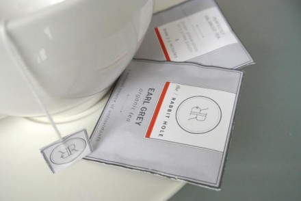
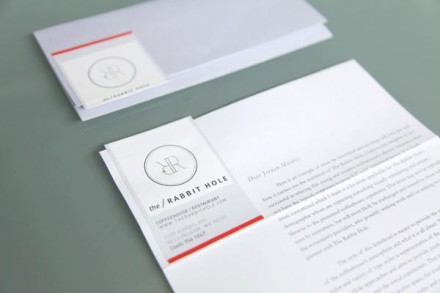
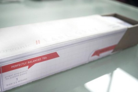
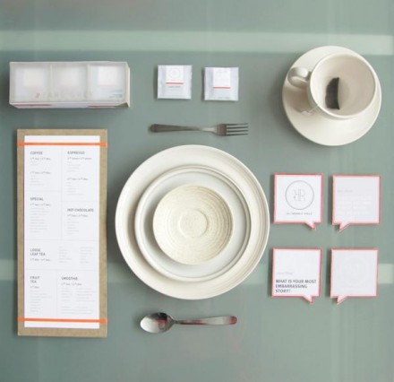
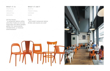
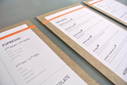
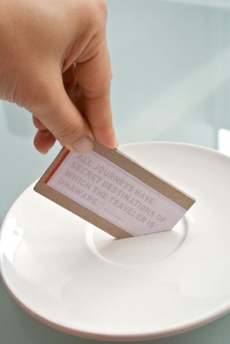
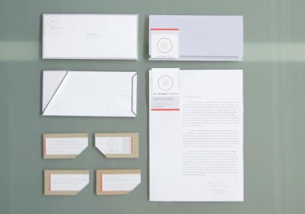
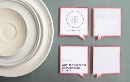
I can appreciate the quiet simplicity I believe Tiffany Hsu was going for in her branding of coffee shop the Rabbit Hole. The brand is shrouded in white, a suitable color for a brand influenced by the gentle nature of the rabbit. Unlike many brandings I’ve seen for coffee houses, the Rabbit Hole takes a different turn in vibe and tone. I don’t think I’d say other brands in this category have a buzz-inducing brand, but it’s clear many of them have tried to incorporate colors and other energetic aspects into their branding. I get it and I think it’s an appropriate brand choice, but I commend these folks for going a different way. There’s starkness to this brand with all the white and I don’t think it’s a bad thing. It works to create an upscale feel, but some of the personality they show on various paper products like tea bag packaging and napkins is downright brilliant. The juxtaposition between clever and hospital clean is one of the surprising parts about this branding. This brand was built for symmetry and they project a calming influence. It’s kind of the opposite of what you’d expect from a coffee house and that’s what makes it so great.

