This is the first of many new categories of content I plan to bring to Grits X Grids called A & A (Artists & Agencies). Our first interview is with John Turner of Boy Burns Barn.
1. Tell us a little bit about your studio and yourself.
BoyBurnsBarn was originally my moniker for my online portfolio that I launched back in 2000. It sounded more interesting then using my real name and it stuck. Ultimately it became the name of my studio which started in 2007 which is when I landed my first “real” client: TAP in Atlanta. The original goal was to take some time off from the 9 to 5 life, really commit myself to this one project and then go and find a killer job. Fortunately one thing led to another and I’ve been working on my own since.
After that going back to work for someone seemed impossible. What I love about restaurant branding is how intimate you can be with a consumer. You have a captive audience… its rare to have someone’s attention for that long so it makes it interesting as a designer to find ways to take advantage of that. You also have a responsibility to to create a face that will live up to the expectations of your other collaborators: owner, chef, architect, interior designer, etc.
2. What is your philosophy on how design interprets a restaurant experience?
Well, in some ways you’re putting the finishing touches on a painting that has many artists behind it. A restaurant’s experience has many levels. There’s the space, the objects and items that fill that space, the food, the wait staff, the other patrons, the city… All those things can influence the experience of a restaurant. So, the branding and design needs to be as honest as possible and as a designer you need to be able to respond to those different factors. It becomes really glaring when one element is off…
This is why its really important to be a good collaborator. You need to be able work well with the other individuals who have just as much passion as you do to do good work. Once that chemistry is there it’s pretty awesome how things can start to click.
My approach is to be honest and try to respond well to what the client wants and what I think a patron will enjoy. Sometimes you can let your design lead the charge to entice people to come inside… Other times you need to know when design needs to take a step back and other elements take over.
In the end the hardest job is making sure the food is good. So, really my job is easy compared to that. Sometimes you have to remember that people are going to come and eat good food no matter what the design looks like. Respect the role of the restaurant and let the design flow from there.
3. When approaching a new concept everyone says they’re going to have great service and great food. How do you get down to the root vision?
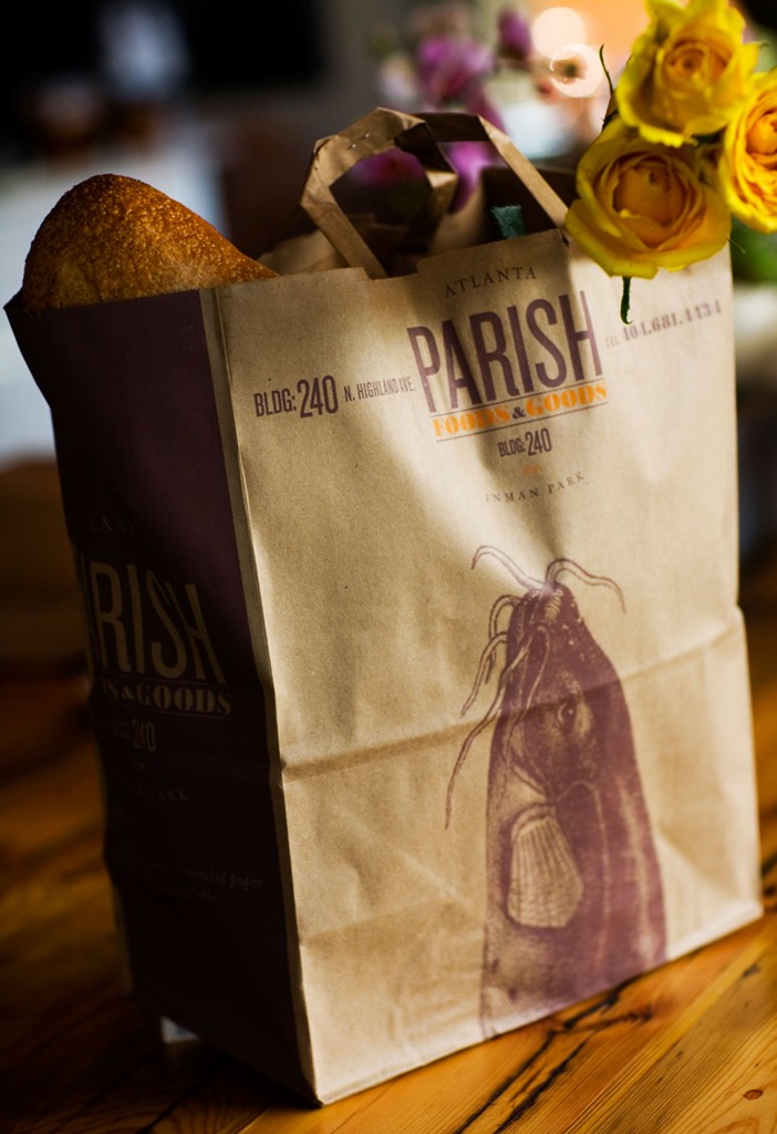
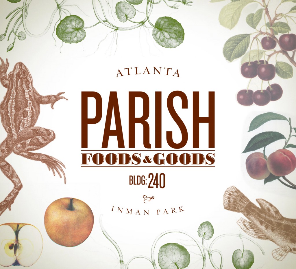
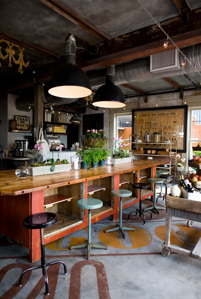
When working on Parish in Atlanta we had this amazing old building that was being gutted. I was told to think of the logo I needed to create as something we discovered painted on the wall 100 years ago after pulling back all of the old plaster. That was one of the best client directions I’ve ever received… Everything that that restaurant became was inspired by that thought.
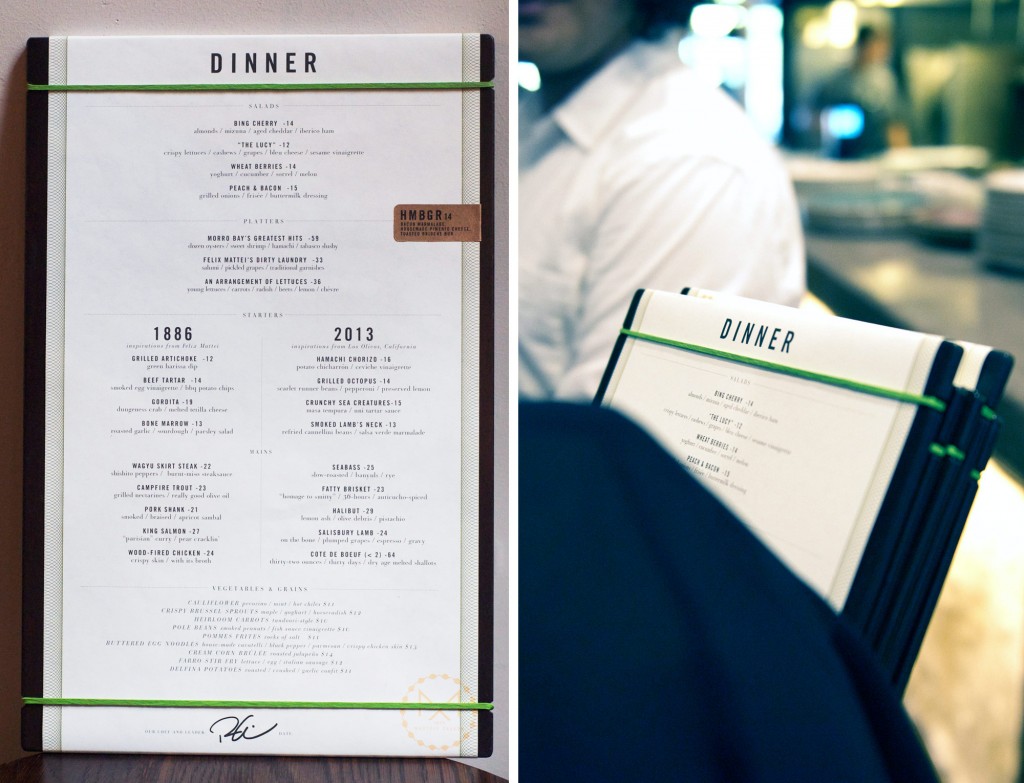
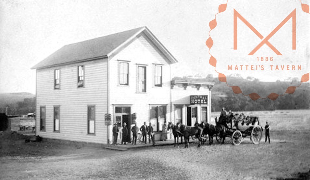
With Mattei’s in Los Olivos we were working with an establishment that has roots back to the late 1800s and a close knit town that hasn’t changed too much and perhaps doesn’t want to. In this case the branding was playing a key role in showing that Mattei’s was still going to be a good trusty neighbor. We were really sensitive to both the history of the brand/building as well as the people in the town. We were able to create a good balance between nostalgia and modern with a touch of humble wit.
The rest of the answer is sort of in the question. You need to have a focused, singular vision from the beginning. This is true with any branding project. As the development of the restaurant evolves and more elements are added and branded you need to be able to go back and ask, “does this represent the original vision, yes or no.” If yes, great. If no, lets know why so we can better identify the right and wrong ideas for bringing a brand to life.
I’m really big on brand voice. I’m always trying to figure out how a brand should “speak” to a patron, what words or terms are used, or even symbols, patterns, illustrations… I feel this is a big part of turning people into brand advocates. We’re essentially teaching them how to talk about the brand to their friends, families or strangers.
My method of pulling out a client’s true vision is usually by speaking in metaphors which can at times be annoying I’m sure. I’ll sometimes describe a restaurant as a book, or a person, a vacation you name it. In all instances there’s a beginning, middle and end. I try to get a client to tell me how they see the story unfold for someone who’s a new customer and a loyal one. Even if this leads to them babbling on and on, it gets them talking and from that I can derive the information I need to do my job.
Its always fun to present my work back to them and say, “remember when you said ‘this’ or ‘that”, well here’s how I interpreted that visually!” It gives me the anchor I need to tie my work back to their own words in a fun way.
4. What are you your three favorite restaurant designs of all time and what makes them so great in your mind?
Thats a really tough one… From a purely branding perspective I think Public in NYC is really skillfully done. They’re able to update their menu often and have it still look special and unique. Thats one of the harder tricks to pull off.
I love the concept of NoMad’s cocktail menu / playing cards. Very clever…
After that I really prefer the UNdesign of many of my neighborhood restaurants.
5. What makes designing restaurants in your market different from other places?
Well, I’ve done restaurant branding for places in all different parts of the country. The trends I usually see are in the language and delivery style of the menu. I think the trends are more based on the type of crowd your trying to appeal to.
As mentioned, Matteis in Los Olivos wanted to be approachable and town friendly but also a destination for people to travel to.
Roof in Chicago was meant to be a spectacle… ironically this led to a less is more approach with the brand design.
6. What is your number one piece of advice for a restaurant owner?
As far as it relates to working with a designer on the branding I would say to know your vision and be able to express it. Why you don’t like something is just as important as why you do.
Choose a designer you feel you can collaborate with honestly, otherwise the work will look forced. Opening a restaurant is already such an incredibly hard task, the last thing you want to deal with is a designer who either doesn’t ‘get you’ or is hard to work with.
I’ll also add: Let your designer do what they’re good at… Trust them to take some chances and show you something you didn’t expect.
7. Any advice for young designers?
Don’t lose your passion for design. Ever. Thats what will get you through those times when there’s not client, work, or you have a terrible boss who’s holding you back.
Never stop designing and trying to get better, even if there are no clients, no projects or money. All skills are perishable and if you don’t practice it that skill will atrophy. You want to be ready when the time comes…
It all sounds a bit cliche but it;s cliche for a reason.
8. Tell us about the featured work you chose and why you chose to showcase it.
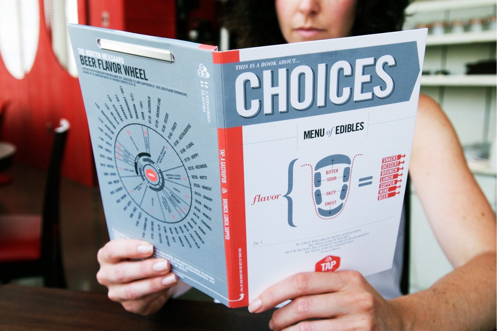
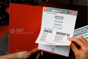
TAP: Tap was and still is a fun project from the very beginning. My approach early on was thinking of this as a place to go for a great beer and great conversation. With that angle in mind I infused small details throughout the pieces that encouraged conversation. An engaging menu with famous quotes a a beer tasting wheel. Coaster conversation starters. And barrel matches representing the kegs in the glass keg vault above the bar. I thought it would be fun if the branding “started” the conversation and the beer would take care of the rest.
PARISH: To see this building transform from a deserted, graffiti covered ruin to what it is now is amazing. I kept the branding understated but pick my spots to infuse something engaging. I always love going there and appreciating that space… to see see only small parts of the branding “peek-a-booing” here and there puts a smile on my face and was a good example of branding restraint.
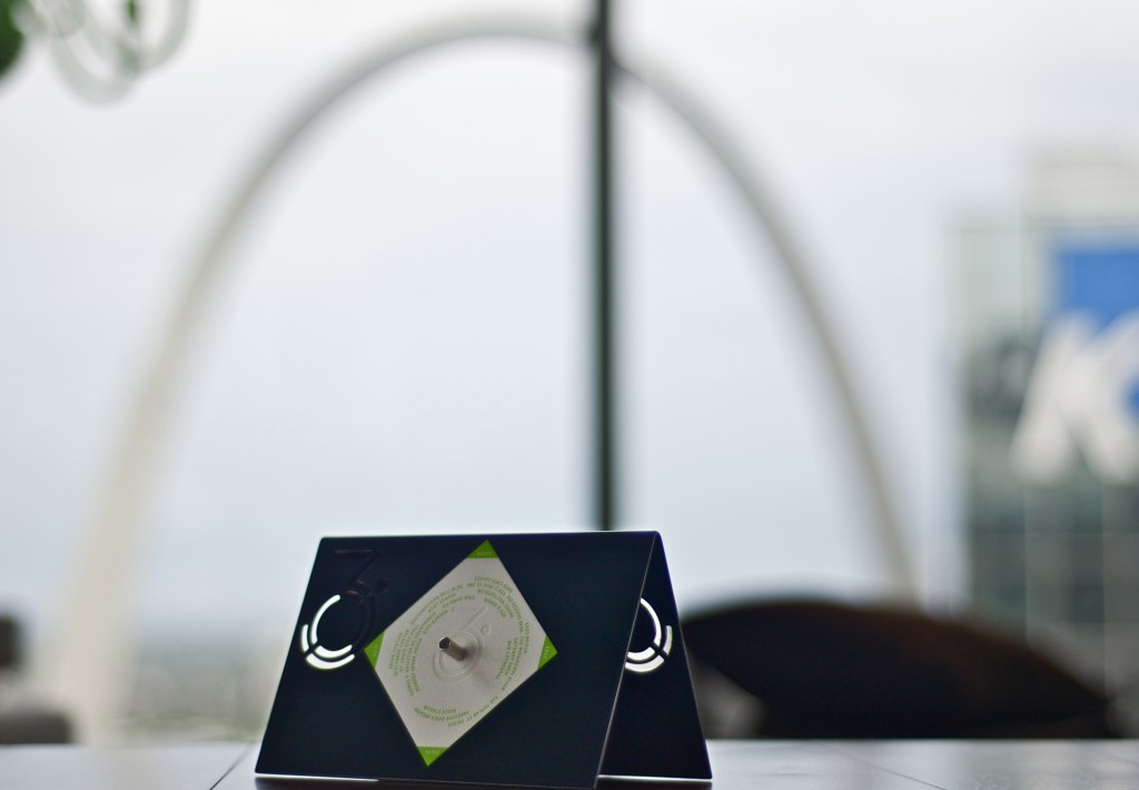
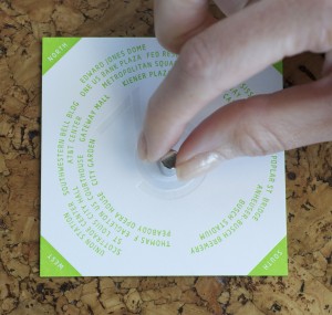
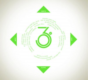
THREE SIXTY: Its really all about the view. While the space itself and the food is great a bit part of the personality is the few all around you, hence the name. My hook was taking advantage of that and creating letter pressed cards that could be magnetically placed on the tables facing north with a list of the land marks all around you. This way you had this little guide helping you identify landmarks. I think this is a great way to connect the branding/establishment to the consumer.
MATTEI’S: The original building was built in 1886 as a hotel and as a business has been thriving ever since with no name change. We wanted to bridge history with modern. Something that is very prevalent in the menu and physical space. The branding was no different. You can choose menu with inspiration from 1886 or from 2014. From this real design challenge we arrived at balance of old world charm and new world wit.
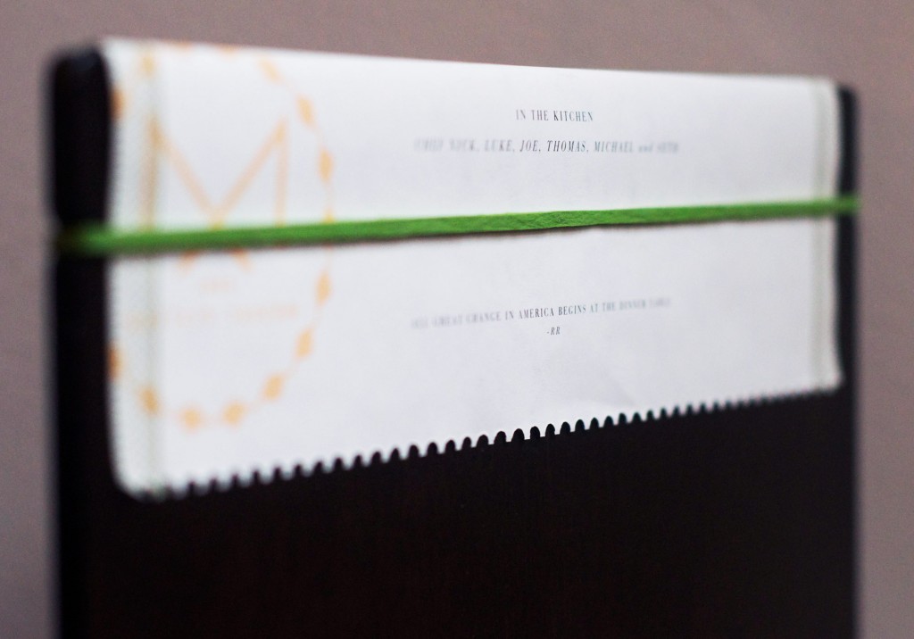
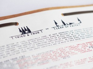
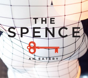
THE SPENCE: After winning Top Chef All-Stars, Richard Blais needed a place to cook. This is basically his kitchen… but everyone’s invited to partake in what he’s cooking. The term Spence is old Irish slang for dispensary. Putting a restaurant brand together for someone with such a big personality we opted to be a bit more understated and abstract. The key is means the food is approachable. Its a key to Blais’s spence and its not meant for just the foodie. The brand is a clean and simple yet there are quirks. A wine list that shows a Tried and True list and a Leap of Faith list. With a few touches of personality like this we let the food do the rest of the talking.
###
Thanks again John for offering your time and insights! Stay tuned for more interviews and profiles on Grits X Grids. Want us to talk to a specific artist or agency? Post in the comments below and we’ll reach out to them. Want to feature your work? Click here to for submission guidelines.

