I’ve had Stir and Enjoy on my radar ever since they dropped the excellent work for Julian Restaurant a few years back. Lead by Brent Anderson, Stir has gone on to design amazing restaurant brands throughout Kansas City, Missouri. I respect the attention to every detail and how they make sure every little piece is thought through. I had a little chat with Brent about all things restaurant branding and design.
1. Tell us a little bit about your studio and yourself.
I got an early grounding in brand strategy and design while working with a pretty groundbreaking firm in Boston called Catapult Thinking before and after the “dot com crash” in 1999-2000. My wife and I ended up back in her hometown of Kansas City after some time in Los Angeles and I started working with ad agencies. But the love of branding never left me. In 2010 I was getting a bit burnt out on the ad world and by then had already lined up some outside clients for branding work that I did with some of my agency colleagues. I decided that year to make the leap and Stir and Enjoy was born on the premise of, “if I’m going to do this full-time, I want a niche and it’s going to be something of which I never tire.” I love eating and drinking, it’s a wonderful part of life that brings people together. And what I love about branding is its permanence. Advertising is based on short-term flash, provocation and attention-getting. But then it’s gone. Beautiful branding endures and inspires love. It makes people happy and provides an ongoing positive emotional response for them whenever they support that brand. Smart strategic branding is something learned over time, not everyone “gets it.” It’s so much more than great design.
2. What is your philosophy on how design interprets a restaurant experience?
You nailed it when you said “experience.” A restaurant, really any food or beverage retail operation, should be just that. Start to finish. There’s a fine line between thorough and heavy-handed, but to me I should be soaking up the essence of your brand at every logical touchpoint and there should be no weak links. From the signage, to the paint colors, to displays and decorations, to printed promotional material and online, there should be a coordination that feels well thought-out, but not repetitive. The best-branded businesses are the ones that you remember and want to return to based on the whole experience, not just one aspect. You don’t even have to put your finger on one thing, you just know it works and it’s always top-of-mind.
3. When approaching a new concept everyone says they’re going to have great service and great food. How do you get down to the root vision?
I must admit I find it really shortsighted when restaurateurs, chefs and food and beverage manufacturers who are sinking their hearts and souls (not to mention their bank accounts) into their efforts think that their product alone is enough to make them successful. When they don’t budget for branding and marketing and consider it important, the missed opportunity truly bums me out. The most fantastic food in the world won’t save a crappy experience in the place where you eat it. It will be sabotaged and cheapened by not having paid attention to that part of the equation. And people WILL remember. When I start with clients, we don’t even get to design until we put the microscope on their brand. What is your offer, your point of difference, your line in the sand? What makes you special? Who is your audience? Are you serving them right? The best clients like to learn. They have confidence in what you bring to them and feel they’re doing the most for the business that dominates their life by hiring you. Once we help them divine their foundation, we can all move forward together with confidence to know that the resulting work across all channels fits, stays true and expresses the vision, in both design and voice.

4. Tell us about the featured work you chose and why you chose to showcase it.
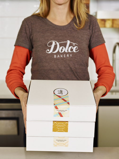
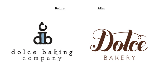
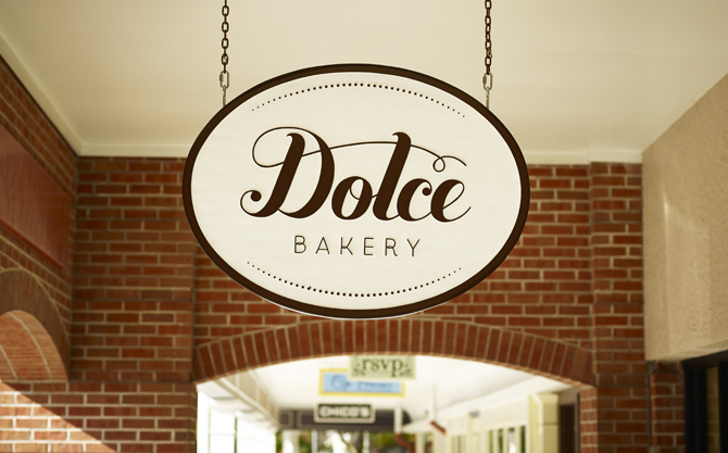
Dolce Bakery: Some of our most recent work. I like this rebrand because it stays so true to the owner’s original inspiration and the brand’s essence, while elevating the brand and performing under distinct constraints. She and her existing customers loved it and it’s been well received in the community.
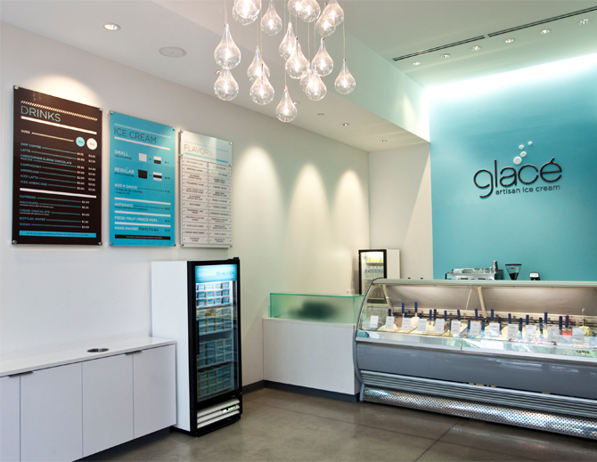
Glace Artisan Ice Cream: The perfect scenario where we were involved with the client from the very beginning when all there was was a name. We were able to collaborate with the architect to bring the brand completely into the space from the ground up and then design every possible consumer touchpoint.
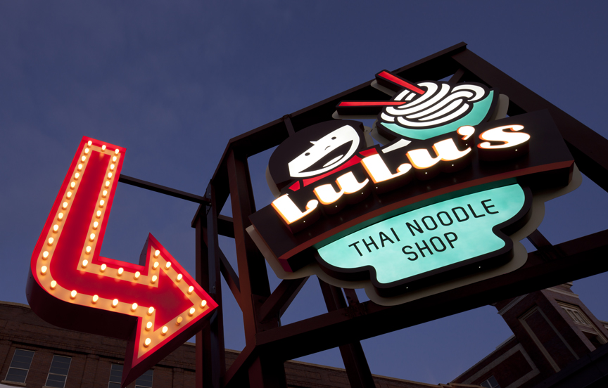
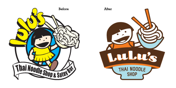
Lulu’s Thai Noodle Shop: I particularly like this rebrand because of how we were able to affect the space. We had that great outdoor wall to take advantage of and the opportunity to make some standout signage, as well as creating lamps from a design element.
5. What are you your three favorite restaurant designs of all time and what makes them so great in your mind?
Whoa. Tough call. My mind immediately leaps to the phenomenal work by NY architecture/design firm Avroko. Their Soho restaurant Public was one of the first places I went into where I felt it immediately and they had all these great touches all over the place that just embellished the concept. They have a book of all they’ve done, and for good reason. They’re the consummate example of restaurant experiences to me. Just beautiful and full of personality. There was obviously some serious money there to make them happen, but a big budget doesn’t guarantee all-around greatness. I’ve been to grandiose restaurants in New York and Las Vegas, in particular, where it was obvious millions were spent, but they didn’t give me same buzz I had when I went to a wonderfully branded little café in Santa Barbara wine country that was just one man’s vision. I also particularly like it when a concept catches me off guard and puts a great signature twist on something familiar. On our honeymoon my wife and I drove around Tuscany and there was a small local restaurant C’era una Volta that served rustic food characteristic of the region, but the brand wasn’t built on tradition. It had a modern feel with an obvious sense of humor that made it totally unique and endearing. I’m also always intrigued by a company that can make a great brand work with consistent strength across every channel and in multiple outlets. Say what you will about Starbucks, they know what they’re doing and are a true innovator in creating an unmistakable “experience.” Chipotle has done a great job too.
6. What makes designing restaurants in your market different from other places?
I’ve been in Kansas City for ten years now, but over the last five in particular a great energy has been developing here, particularly in food and beverage. It feels like every day I see word of an unexpected new venture, from fine dining to an artisan butcher to a champagne bar. It’s a great time to be here and a good place to launch new businesses because of the lower cost of living and peoples’ interest in new tastes and concepts.
That said, there’s still a budgetary issue. We still face people treating design and branding like a commodity and/or something far down the priority list. There’s always someone who will do it cheaper and always a relative or friend of a friend that the business owner knows who could possibly get the job. The onus is on us to educate and clearly communicate not only why we’re different, but that we deliver added value and experience as consultants.
7. What is your number one piece of advice for a restaurant owner?
Please treat the branding and marketing aspect of running your business as an asset, not an afterthought. A proper investment now will continue to pay dividends years down the line. In this particular discipline, you do truly get what you pay for and you’ll be even more excited about what you do when it’s well-branded. You have one chance to come roaring out of the gates right and if you don’t seize that opportunity, you could be spending more to do it properly later.
8. Any advice for young designers?
Be an ever-hungry student of design, yes. Know all you can about it. But also get out and be a student of life. Travel. Don’t depend on your hometown. Do something besides design. All of that will come back and give you resources that will benefit your design work. Broaden your skillset whenever you can, from traditional to digital. Don’t live in a Pinterest/design blog bubble. There’s amazing work out there, sure, and it can inspire or deflate you. When you get to better know yourself, you’ll be better at your job. A local magazine here recently asked the question, “What would you tell your 25 year-old self?” Here was my response: http://www.stirandenjoy.com/2014/01/letter-to-a-25-year-old/
I’m sure Brent will be looming around the comments section on this interview so feel free to reach out and ask some questions! Stay tuned for more interviews with Artists & Agencies.


One Response
Great article Brent. Proud of you handsome.