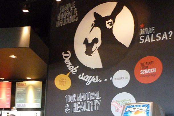
Barburrito restaurant branding

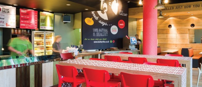
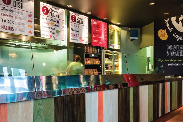
Bright pops of colors that play off of wood grains and chalkboard; fun patterns with whimsical type treatments and a big high contract picture of a donkey.. what’s not to love about the Barburrito brand experience by Caulder & Moore. Just wish we had more images to share. This looks like a fun one!
home_slider_template_0_003ac1973ac197

project_holder_2_0_00262197262197

project_holder_3_0_00262197262197

Discuss this Project

Leave a Reply

This site uses Akismet to reduce spam. Learn how your comment data is processed.

The Forktales Podcast™: Interviews with restaurant industry leaders and visionaries

Restaurant and advertising industry headlines and thinking

Reviews of restaurant experiences from around the globe 

Reviews of our favorite design, business, & restaurant books

Our favorite typography and fonts

Inspiration in your inbox

Get the latest inspiration in your inbox every Monday morning, for FREE!

"*" indicates required fields

This field is for validation purposes and should be left unchanged.

Delicious Bits in your Inbox!

Get the latest and greatest content delivered to your inbox for free!

"*" indicates required fields

This field is for validation purposes and should be left unchanged.