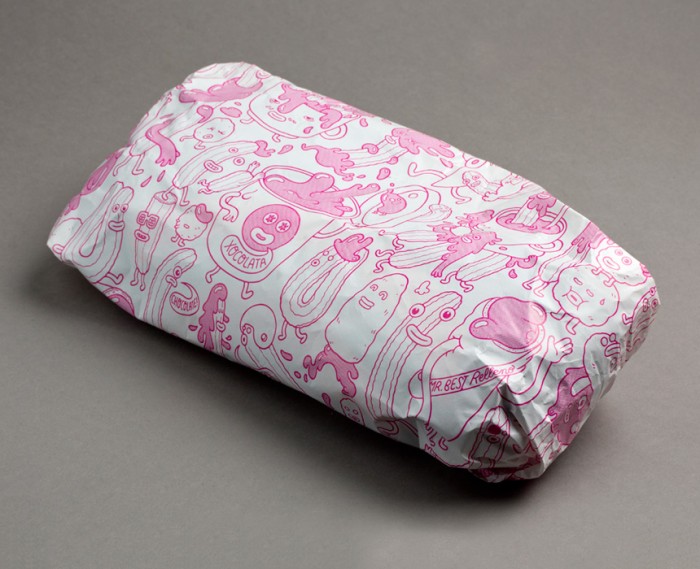
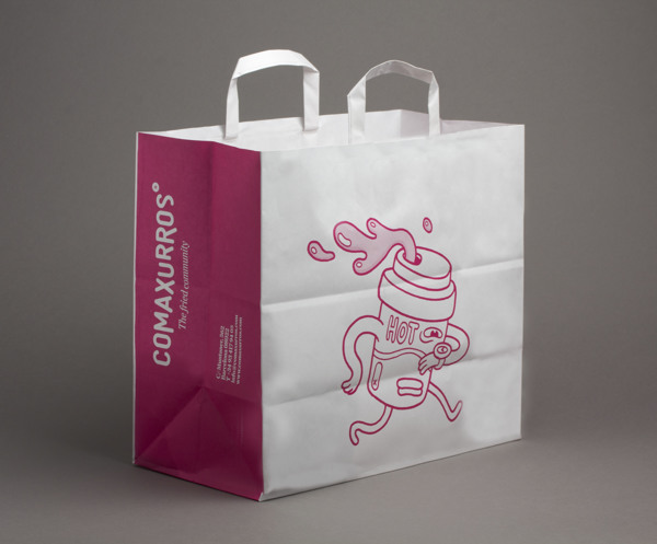
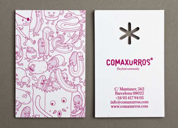
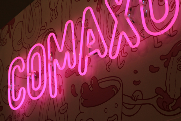
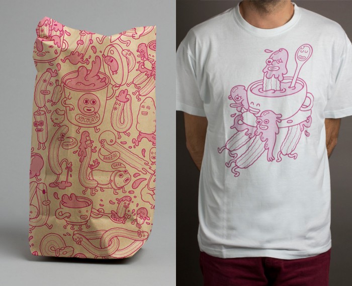
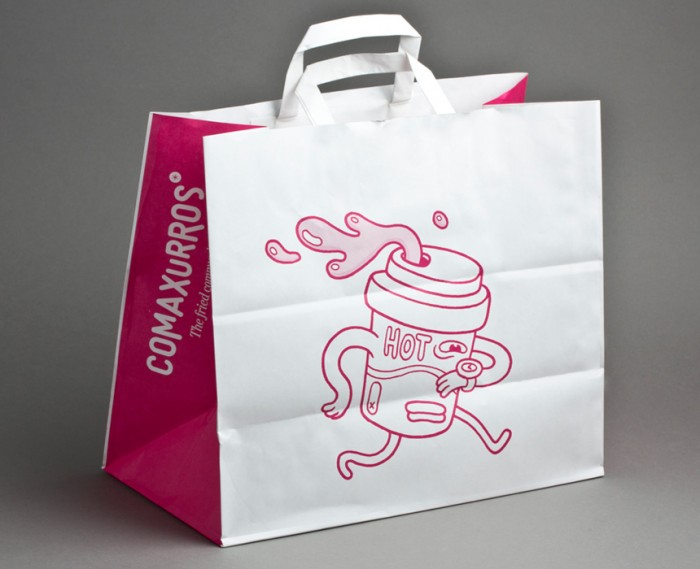
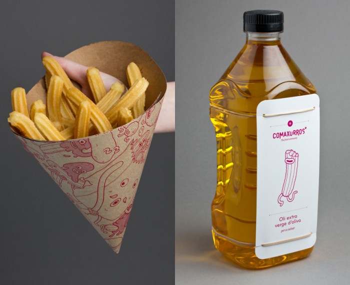
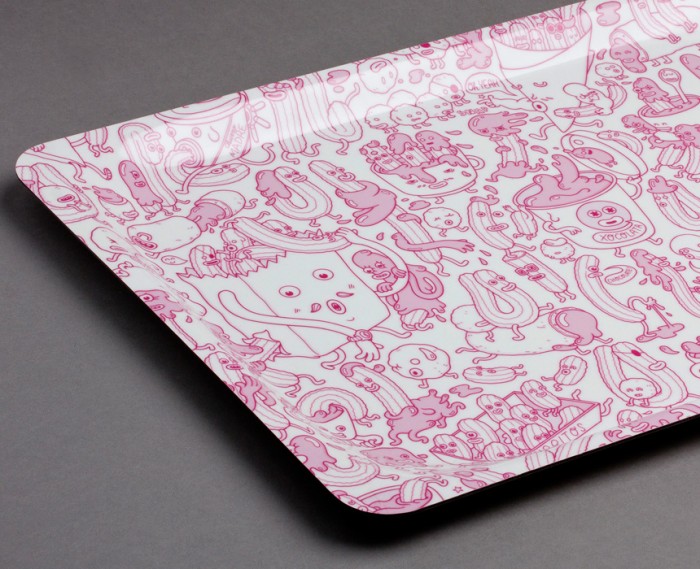
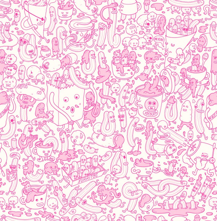
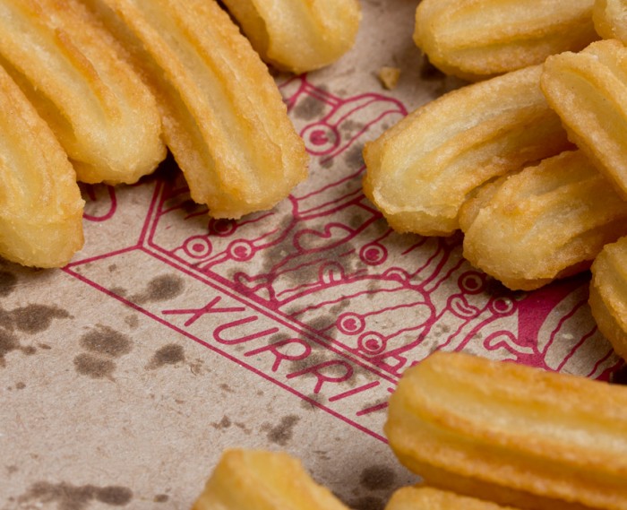
Now this is fun. A restaurant that’s based on the amazingly tasty churro. A churro is a spanish pastry that’s basically dough, fried crispy with some awesome topping situations happening. This churro stand sought the help of some creative genius supplied by by Lo Siento with the Illustration help of Brosmind. The identity reminds me of an Adult Swim style cartoon, based on funny, semi-weird illustrations. The bright pink primary color pops on the solid whites and natural paper textures making for an identity that gets a bunch of attention. The logo is simple, but great. It allows the illustrations to help creative a graphic language. And the neon signage is just boss.
Found this gem at Brand New
